Hey there! Vishnu Rajoria here from CSLAB Computer Institute in Sikar. As a coding instructor and full stack developer, I love sharing simple yet eye-catching projects. Today, let’s dive into creating an animated circle using just HTML and CSS.
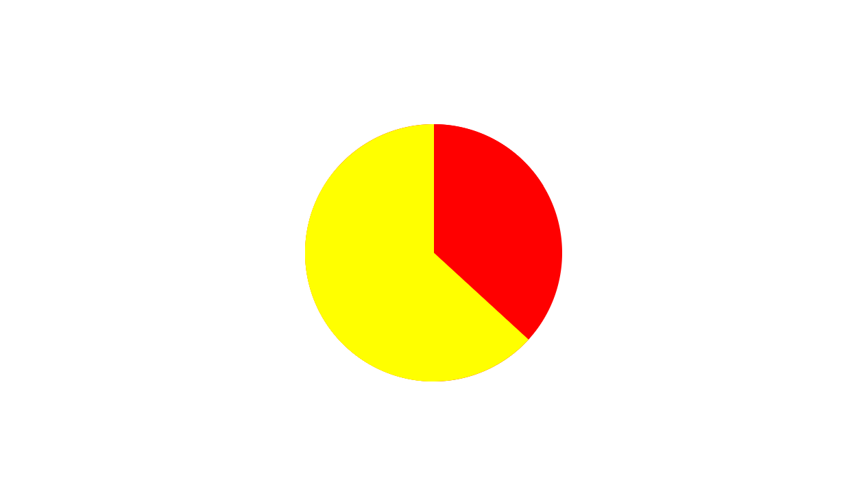
This project is perfect for beginners looking to understand how CSS animations work. We’ll create a circle that changes colors and rotates in segments. It’s simpler than it sounds, I promise!

See the Pen Progress Circular by CSLAB Software Development and Computer Training (@CSLAB) on CodePen.
HTML CODE
<!-- Main container for the animated circle -->
<div class="container">
  <!-- Container for the circle and its segments -->
  <div class="circle-container">
    <!-- Left half of the circle -->
    <div class="circle"></div>
    <!-- Right half of the circle -->
    <div class="circle"></div>
    <!-- Top-right quarter of the circle -->
    <div class="circle top-right"></div>
    <!-- Bottom-right quarter of the circle -->
    <div class="circle bottom-right"></div>
  </div>
</div>
CSS CODE
/* Ensure full width and height for html and body */
html, body {
  width: 100%;
  height: 100%;
}

/* Center the content vertically and horizontally */
.container {
  display: flex;
  height: 100%;
  align-items: center;
  justify-content: center;
}

/* Main circle container */
div.circle-container {
  width: 300px;
  height: 300px;
  background: red;
  position: relative;
  border-radius: 100%;
  overflow: hidden;
}

/* Base styles for circle segments */
div.circle {
  position: absolute;
  width: 150px;
  height: 100%;
  left: 0;
  box-sizing: border-box;
  display: inline-block;
  background: yellow;
}

/* Right half of the circle */
div.circle:nth-child(2) {
  background: yellow;
  left: 50%;
  z-index: 1;
  animation: rotate180 3s forwards linear;
  animation-delay: 0s;
  transform-origin: -0% 50%;
}

/* Left half of the circle */
div.circle:nth-child(1) {
  animation: rotate180-2 3s forwards linear;
  animation-delay: 3s;
  transform-origin: 100% 50%;
  z-index: 2;
}

/* Top-right quarter of the circle */
div.top-right {
  background: green;
  height: 50%;
  left: 50%;
  top: 0%;
  z-index: 3;
  animation: top-right 3s forwards linear;
  animation-delay: 0s;
}

/* Bottom-right quarter of the circle */
div.bottom-right {
  background: pink;
  width: 100%;
  height: 50%;
  left: 100%;
  bottom: 0;
  z-index: 4;
  animation: bottom-right 1s forwards linear;
  animation-delay: 3s;
}

/* Animation for right half rotation */
@keyframes rotate180 {
  0% {
    background: yellow;
    transform: rotate(0deg);
  }
  99% {
    transform: rotate(179deg);
    background: yellow;
  }
  100% {
    transform: rotate(180deg);
    background: red;
  }
}

/* Animation for top-right quarter */
@keyframes top-right {
  0% {
    top: -100%;
    background: red;
  }
  99% {
    top: 0;
    background: red;
  }
  100% {
    background: red;
  }
}

/* Animation for bottom-right quarter */
@keyframes bottom-right {
  0% {
    left: 100%;
    background: red;
  }
  99% {
    left: 49%;
    background: red;
  }
  100% {
    left: 50%;
    background: red;
  }
}

/* Animation for left half rotation */
@keyframes rotate180-2 {
  0% {
    transform: rotate(0deg);
  }
  99% {
    transform: rotate(179deg);
    background: yellow;
  }
  100% {
    transform: rotate(180deg);
    background: yellow;
  }
}
Key Points:
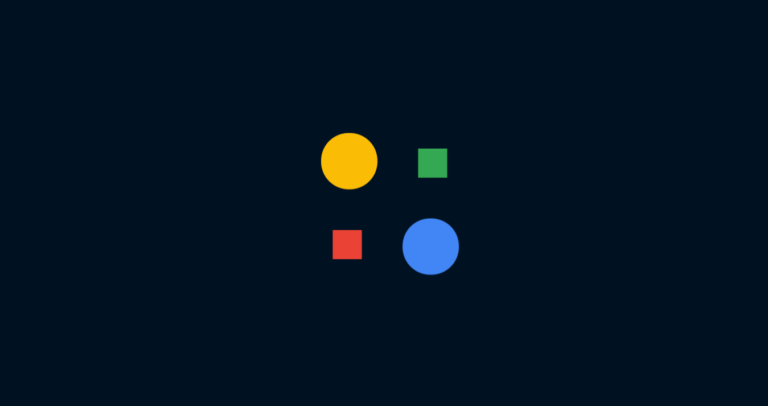
- We use a main container div to center our circle
- The circle is divided into four segments
- CSS animations handle all the movement and color changes
- No JavaScript required!
Here’s what makes this project cool:
- It teaches you about positioning in CSS
- You’ll learn how to use CSS animations and keyframes
- It shows how to layer elements using z-index
The HTML structure is straightforward – we’re just nesting divs. The magic happens in the CSS. We use absolute positioning to place our circle segments and then animate them using @keyframes.
One of the trickiest parts is getting the timing right. We use animation-delay to create a sequence of movements that make the circle look like it’s filling up.
Remember, the key to learning is practice. Try tweaking the colors or timings to make it your own!
If you’re in Sikar and want to learn more about web development, come visit us at CSLAB. We’d love to help you start your coding journey!
Happy coding, everyone!