Hey there, fellow coders! Vishnu Rajoria here, your friendly neighborhood coding instructor and Full Stack Developer from CSLAB Computer Institute in Sikar. Today, I’m excited to walk you through a cool project: building an interactive circular meter using HTML, CSS, and JavaScript.
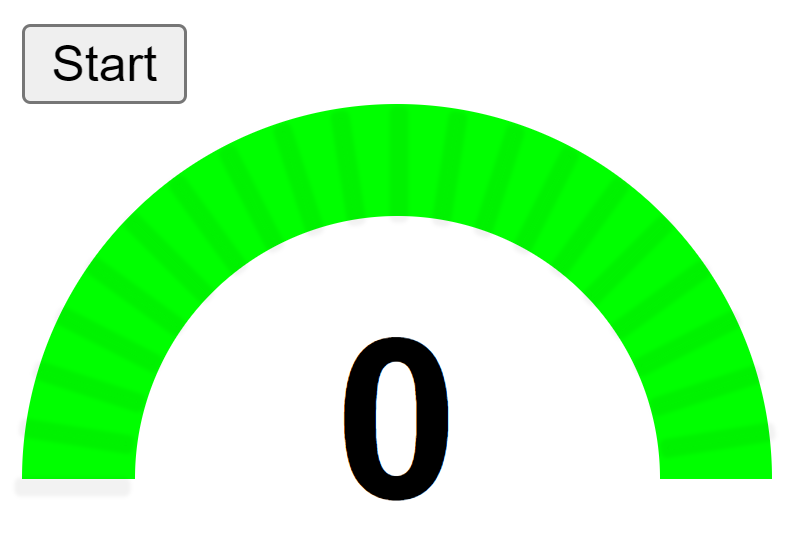
What We’re Building
We’re creating a circular meter that fills up from 0 to 100 when you click a button. It’s a great way to visualize progress or data in a visually appealing manner. Here’s what makes it awesome:
- It’s interactive – just click a button to start the animation
- The meter fills up smoothly from 0 to 100
- We’ve got some neat visual elements like tick marks around the circle
The Key Components
Let’s break down the main parts of our code:
- HTML Structure
- A button to start the animation
- A container for our meter
- A div to display the current reading
- CSS Magic
- We use
conic-gradientto create the circular fill effect - The meter is actually rotated -90 degrees to start from the bottom
- We add a white circle in the center for that donut look
- JavaScript Functionality
- An event listener on the button to start the animation
- A function to increment the meter reading and update the display
- Another function to create those cool tick marks around the circle
See the Pen meter animation with JS by CSLAB Software Development and Computer Training (@CSLAB) on CodePen.
HTML CODE :
  <!-- Button to start the meter animation -->
    <button class="control-meter-btn">Start</button>

    <!-- Container for the meter and its components -->
    <div class="meter-container">
        <!-- Container for the meter reading lines -->
        <div class="line-container">
            <!-- Lines will be dynamically added here by JavaScript -->
        </div>
        <!-- The circular meter itself -->
        <div class="meter"></div>
    </div>

    <!-- Display for the current meter reading -->
    <div class="meter-reading">0</div>
CSS CODE :
        /* CSS styles for the circular meter */
        .meter-container {
            width: 200px;
            height: 100px;
        }

        .meter {
            width: 200px;
            height: 200px;
            background: conic-gradient(#0f0 180deg, #fff 0deg);
            border-radius: 50%;
            position: relative;
            transform: rotate(-90deg);
        }

        .meter:after {
            content: "";
            width: 70%;
            height: 70%;
            background: #fff;
            position: absolute;
            top: 15%;
            left: 15%;
            border-radius: 50%;
        }

        .meter-reading {
            width: 200px;
            font-size: 60px;
            font-weight: bold;
            font-family: arial;
            text-align: center;
            margin-top: -50px;
            position: absolute;
        }

        .line-container {
            width: 200px;
            height: 200px;
            position: absolute;
            transform: rotate(-90deg);
            z-index: 999;
            top: -68px;
            pointer-events: none;
        }

        .line {
            width: 1px;
            height: 27px;
            background: rgba(0,0,0,0.05);
            position: absolute;
            transform-origin: 0px 100px;
            box-shadow: 0px 0px 1px 2px rgba(0,0,0,0.05);
            border-radius: 50px;
        }
JAVASCRIPT CODE :
 // JavaScript code for meter functionality
        let controlMeterBtn = document.querySelector(".control-meter-btn");
        let meter = document.querySelector(".meter");
        let meterReadingElement = document.querySelector(".meter-reading");

        // Event listener for the start button
        controlMeterBtn.addEventListener("click", () => {
            startMeterAnimation();
        });

        // Function to animate the meter
        function startMeterAnimation() {
            let meterReading = 0;
            let maxMeterReading = 100;
            let timer = setInterval(() => {
                meterReading++;

                if (meterReading >= 101) {
                    clearInterval(timer);
                } else {
                    meterReadingElement.innerText = meterReading;
                    meter.style.background = `conic-gradient(#0f0 ${meterReading * 1.8}deg, #fff 0deg)`;
                }
            }, 10);
        }

        // Add reading lines overlay
        let lineContainer = document.querySelector(".line-container");
        let lineCount = 20;
        let linesHTML = "";
        let degreeDifference = 180 / lineCount;
        for (let i = 0; i < lineCount; i++) {
            linesHTML += `<div style="transform:rotate(${i * degreeDifference}deg)" class='line'></div>`;
        }
        lineContainer.innerHTML = linesHTML;
The Cool Bits
Here are some of the nifty tricks we’re using:
- Conic Gradient: This CSS feature lets us create that pie-chart-like fill effect.
- Transform Origin: We use this to position our tick marks correctly around the circle.
- SetInterval: This JavaScript function helps us animate the meter smoothly.
Why This Matters
Understanding how to create interactive visual elements like this is super important in web development. It’s not just about making things look pretty – it’s about presenting data in a way that’s engaging and easy to understand.
Wrapping Up
And there you have it, folks! A simple yet effective circular meter that you can use in all sorts of projects. Whether you’re building dashboards, progress indicators, or just want to add some visual flair to your site, this little meter has got you covered.
Remember, the key to mastering coding is practice and experimentation. So take this code, play around with it, and see what cool modifications you can come up with!
Happy coding, everyone! 😊
— Vishnu Rajoria
Coding Instructor & Full Stack Developer
CSLAB Computer Institute, Sikar