Hey there! Vishnu Rajoria here, your friendly neighborhood coding instructor and Full Stack Developer from CSLAB Computer Institute in Sikar. Today, I want to share a cool little project that’ll jazz up your website: an animated menu button!
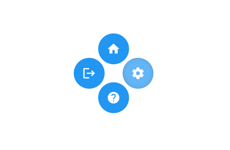
This button starts as a simple ‘+’ sign, but when you hover over it, it transforms into a circular menu with four options. It’s a great way to add some interactivity to your site without overwhelming your users. Let’s break it down:
What We’re Building
- A circular button that expands into four menu options on hover
- Icons for home, settings, logout, and help
- Smooth animations for a polished look
The Key Ingredients
- HTML structure for our button group
- CSS magic for styling and animations
- Google’s Material Icons for sleek, recognizable icons
See the Pen FLOATING BUTTONS HTML & CSS by CSLAB Software Development and Computer Training (@CSLAB) on CodePen.
HTML CODE
<!-- Link to Google Material Icons font -->
<link
    href="https://fonts.googleapis.com/icon?family=Material+Icons"
    rel="stylesheet"
/>

<!-- Main container for the button group -->
<div class="container">
    <!-- Button group with animated menu -->
    <div class="btn-group">
        <!-- Central span for creating the '+' symbol -->
        <span></span>
        <!-- Home button -->
        <button class="btn"><i class="material-icons md-48">home</i></button>
        <!-- Settings button -->
        <button class="btn"><i class="material-icons">settings</i></button>
        <!-- Logout button -->
        <button class="btn"><i class="material-icons">logout</i></button>
        <!-- Help button -->
        <button class="btn"><i class="material-icons">help</i></button>
    </div>
</div>
CSS CODE
/* Reset default margin */
* {
    margin: 0;
}

/* Set background color for the body */
body {
    background: #fff;
}

/* Style for the main container */
.container {
    height: 200px;
    width: 300px;
    position: absolute;
    top: 50%;
    left: 55%;
    transform: translate(-50%, -50%);
}

/* Style for the button group */
.btn-group {
    height: 160px;
    width: 160px;
    border-radius: 160px;
    transform: scale(0.5);
    font-family: calibri;
    position: absolute;
    cursor: pointer;
    transition: all 0.5s cubic-bezier(0.83, -0.24, 0.24, 1.31);
    background-color: #fff;
    vertical-align: middle;
}

/* Style for individual buttons */
.btn {
    height: 80px;
    width: 80px;
    float: left;
    font-size: 40px;
    line-height: 80px;
    border: none;
    background-color: #2196F3;
    color: #2196F3;
    transition: all 0.5s cubic-bezier(0.83, -0.24, 0.24, 1.31),
        background-color 0.25s ease-in-out, box-shadow 0.25s ease-in-out;
    cursor: pointer;
    display: flex;
    align-items: center;
    justify-content: center;
}

/* Hover effect for buttons */
.btn:hover {
    background-color: #64B5F6;
    box-shadow: inset 0 0 10px rgba(0, 0, 0, 0.15);
}

/* Style for the central span ('+' symbol) */
.btn-group > span {
    height: 60px;
    width: 60px;
    margin: 50px 50px;
    position: absolute;
}

/* Create the '+' symbol using pseudo-elements */
.btn-group > span::before,
.btn-group > span::after {
    content: "";
    background-color: #fff;
    position: absolute;
    border-radius: 10px;
}

.btn-group > span::before {
    width: 10px;
    height: 100%;
    margin: 0 25px;
}

.btn-group > span::after {
    width: 100%;
    height: 10px;
    margin: 25px 0;
}

/* Hover effect for the button group */
.btn-group:hover {
    transform: scale(0.85) rotate(45deg);
    cursor: default;
}

/* Hide the '+' symbol on hover */
.btn-group:hover > span {
    opacity: 0;
}

/* Rotate buttons and change color on hover */
.btn-group:hover > .btn {
    border-radius: 100%;
    color: #fff;
    transform: rotate(-45deg);
}

/* Set border-radius for each button to create a circular shape when combined */
.btn:nth-child(2) {
    border-radius: 80px 0 0 0;
}

.btn:nth-child(3) {
    border-radius: 0 80px 0 0;
}

.btn:nth-child(4) {
    border-radius: 0 0 0 80px;
}

.btn:nth-child(5) {
    border-radius: 0 0 80px 0;
}

/* Adjust margins for buttons on hover to create space between them */
.btn-group:hover > .btn:nth-child(2) {
    margin: -5px 5px 5px -5px;
}

.btn-group:hover > .btn:nth-child(3) {
    margin: -5px -5px 5px 5px;
}

.btn-group:hover > .btn:nth-child(4) {
    margin: 5px 5px -5px -5px;
}

.btn-group:hover > .btn:nth-child(5) {
    margin: 5px -5px -5px 5px;
}

/* Set font size for Material Icons */
.material-icons {
    font-size: 36px !important;
}
How It Works
The secret sauce is in the CSS. Here are the main tricks we’re using:
- We start with a container holding five buttons (one for each menu option, plus the central button)
- The central button is actually just a span with some clever pseudo-elements to create the ‘+’ shape
- On hover, we use CSS transforms to rotate the entire button group and spread out the option buttons
- Each button gets its own border-radius values to create the circular shape when combined
- We use transitions for smooth animations between states
The Cool Parts
- The use of
cubic-bezierfor custom animation timing - How we create the ‘+’ symbol using pure CSS
- The way we position the buttons to form a perfect circle on hover
Why This Matters
As a developer, it’s not just about making things work – it’s about creating experiences. This kind of interactive element can make your website more engaging and fun to use. Plus, it’s a great exercise in CSS animations and transforms!
Remember, the web is your playground. Don’t be afraid to experiment and create something unique. That’s how we grow as developers!
If you want to dive deeper into this code or learn more about web development, come visit us at CSLAB Computer Institute in Sikar. We’re always excited to help new developers level up their skills!
Happy coding, everyone!