Hey there! Vishnu Rajoria here from CSLAB Computer Institute in Sikar. As a coding instructor and full stack developer, I love sharing simple yet powerful web development techniques. Today, let’s break down how to create a custom dropdown menu using HTML, CSS, and JavaScript.
Why Custom Dropdowns?
Custom dropdowns give you more control over the look and feel of your website. They’re great for:
- Enhancing user experience
- Matching your site’s unique design
- Adding interactive elements easily

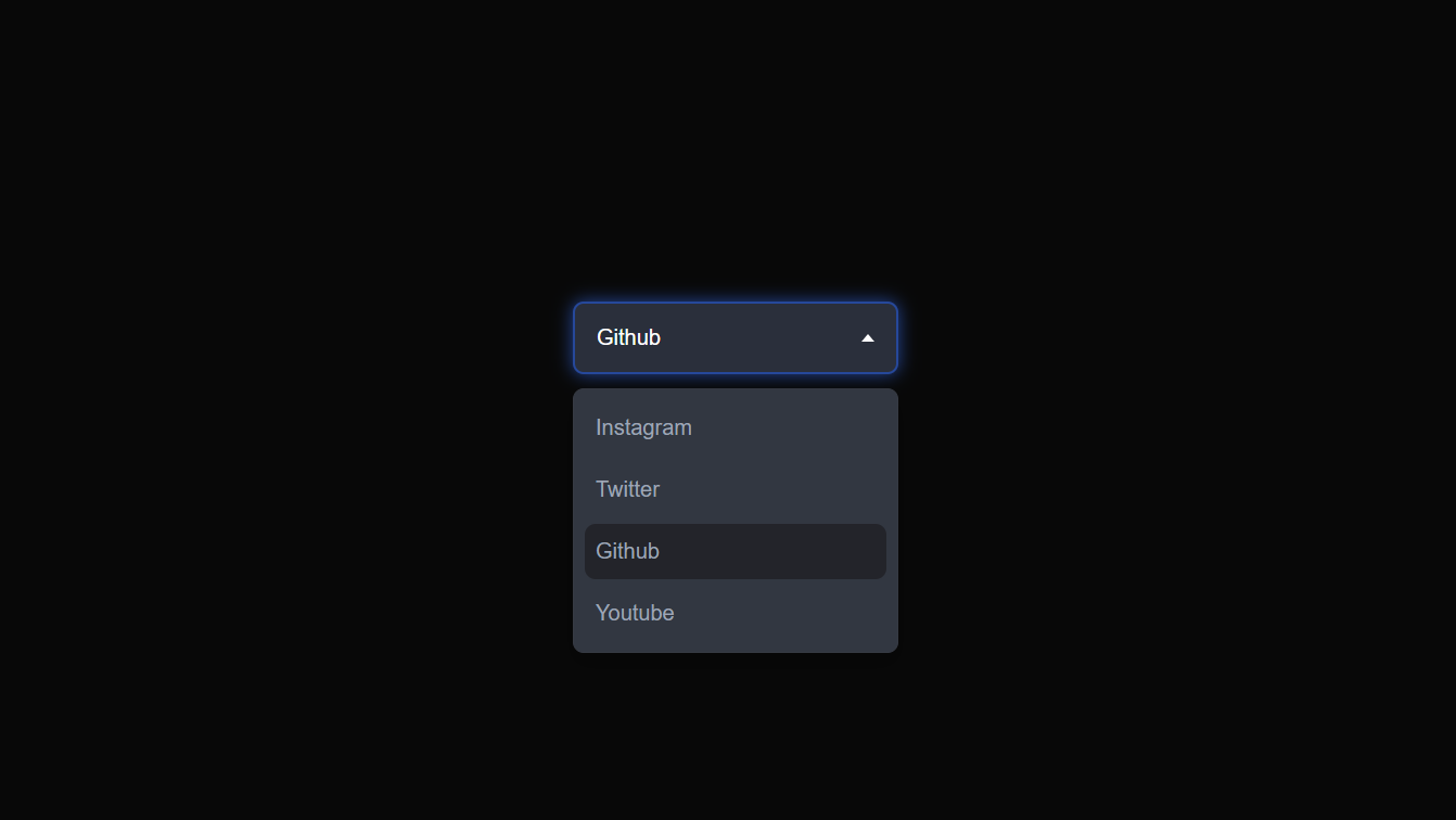
The Structure (HTML)
We start with a simple HTML structure:
- A main
<div>with class “dropdown” - Inside, we have a “select” div to show the chosen option
- An unordered list (
<ul>) for our menu options
The beauty is in its simplicity!
Making It Look Good (CSS)
Here’s where the magic happens. We use CSS to:
- Style the dropdown container and select box
- Create a cool hover effect
- Design a custom caret (that little arrow)
- Hide the menu initially and style its appearance
Pro tip: Use transitions for smooth animations when opening/closing the dropdown.
Bringing It to Life (JavaScript)
JavaScript makes our dropdown interactive:
- We toggle classes to open/close the dropdown
- Update the selected option when a user clicks
- Manage the active state of options
See the Pen Drop -down Menu by CSLAB Software Development and Computer Training (@CSLAB) on CodePen.
HTML CODE
<!-- Custom dropdown component -->
<div class="dropdown">
    <!-- Selected option display -->
    <div class="select">
        <span class="selected">Youtube</span>
        <!-- Dropdown caret icon -->
        <div class="caret"></div>
    </div>
    <!-- Dropdown menu options -->
    <ul class="menu">
        <li>Instagram</li>
        <li>Twitter</li>
        <li>Github</li>
        <li class="active">Youtube</li>
    </ul>
</div>
CSS CODE
/* Reset default styles and set font */
* {
    margin: 0;
    padding: 0;
    box-sizing: border-box;
    font-family: sans-serif;
}

/* Page layout styles */
body {
    min-height: 100vh;
    display: flex;
    align-items: center;
    justify-content: center;
    flex-wrap: wrap;
    background: #080808;
    padding-bottom: 7rem;
}

/* Dropdown container styles */
.dropdown {
    min-width: 15em;
    position: relative;
    top: 0;
    margin: 2em;
}

/* Dropdown select box styles */
.select {
    background: #2a2f3b;
    color: #fff;
    display: flex;
    justify-content: space-between;
    align-items: center;
    border: 2px #2a2f3b solid;
    border-radius: 0.5em;
    padding: 1em;
    cursor: pointer;
    transition: 0.3s;
}

/* Styles for clicked select box */
.select-clicked {
    border: 2px #26489a solid;
    box-shadow: 0 0 0.8em #26489a;
}

/* Hover effect for select box */
.select:hover {
    background: #323741;
}

/* Dropdown caret icon styles */
.caret {
    width: 0;
    height: 0;
    border-left: 5px solid transparent;
    border-right: 5px solid transparent;
    border-top: 6px solid #fff;
    transition: 0.3s;
}

/* Rotated caret for open dropdown */
.caret-rotate {
    transform: rotate(180deg);
}

/* Dropdown menu styles */
.menu {
    list-style: none;
    padding: 0.2em 0.5em;
    background: #323741;
    border: 1px #363a43 solid;
    box-shadow: 0 0.5em 1em rgba(0, 0, 0, 0.2);
    border-radius: 0.5em;
    color: #9fa5b5;
    position: absolute;
    top: 4em;
    left: 50%;
    width: 100%;
    transform: translateX(-50%);
    opacity: 0;
    display: none;
    transition: 0.2s;
    z-index: 1;
}

/* Dropdown menu item styles */
.menu li {
    padding: 0.7em 0.5em;
    margin: 0.3em 0;
    border-radius: 0.5em;
    cursor: pointer;
}

/* Hover effect for menu items */
.menu li:hover {
    background: #2a2d35;
}

/* Styles for active (selected) menu item */
.active {
    background: #23242a;
}

/* Styles for open dropdown menu */
.menu-open {
    display: block;
    opacity: 1;
}
JAVASCRIPT CODE
// Select DOM elements
const dropdown = document.querySelector(".dropdown");
const select = dropdown.querySelector(".select");
const caret = dropdown.querySelector(".caret");
const menu = dropdown.querySelector(".menu");
const options = dropdown.querySelectorAll(".menu li");
const selected = dropdown.querySelector(".selected");

// Toggle dropdown menu on select box click
select.addEventListener("click", () => {
    select.classList.toggle("select-clicked");
    caret.classList.toggle("caret-rotate");
    menu.classList.toggle("menu-open");
});

// Handle option selection
options.forEach(option => {
    option.addEventListener("click", () => {
        // Update selected text
        selected.innerText = option.innerText;

        // Close dropdown
        select.classList.remove("select-clicked");
        caret.classList.remove("caret-rotate");
        menu.classList.remove("menu-open");

        // Update active option
        options.forEach(opt => opt.classList.remove("active"));
        option.classList.add("active");
    });
});
Why This Approach Rocks
- Customizable: Easily change colors, sizes, and animations
- Lightweight: No heavy libraries needed
- Cross-browser compatible: Works great on different browsers
Wrapping Up
Custom dropdowns are a fantastic way to level up your web design skills. They combine HTML structure, CSS styling, and JavaScript interactivity – the holy trinity of front-end development.
Remember, practice makes perfect. Try tweaking the code, add your own flair, and most importantly, have fun with it!
Happy coding, everyone! 👨💻✨