
Hey there, tech enthusiasts! Vishnu Rajoria here, your friendly neighborhood coding instructor and Full Stack Developer from CSLAB Computer Institute in Sikar. Today, I’m going to walk you through a cool little project that’ll jazz up your web design skills – creating stylish browser icons using HTML and CSS.
What We’re Building
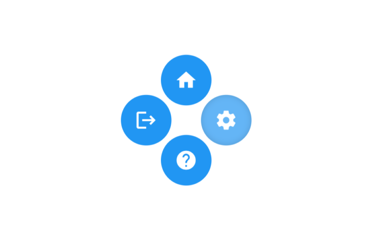
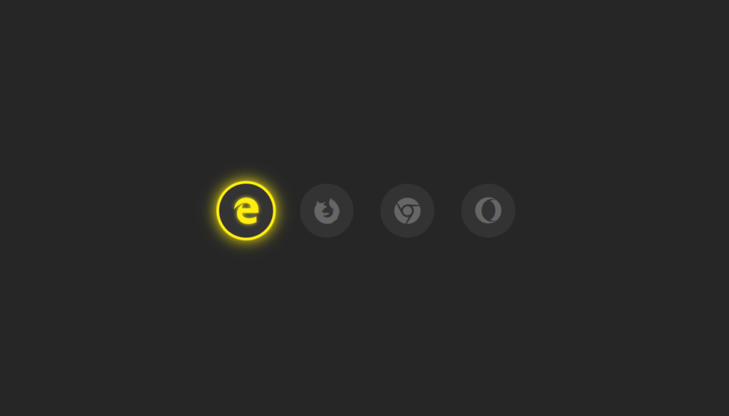
We’re going to create a set of four browser icons (Edge, Firefox, Chrome, and Opera) that light up when you hover over them. It’s a simple yet eye-catching effect that can add a touch of interactivity to your website.
The Key Ingredients
- HTML for structure
- CSS for styling
- Font Awesome for the icons
See the Pen Social -Media Animation css by CSLAB Software Development and Computer Training (@CSLAB) on CodePen.
HTML CODE
<!-- Link to Font Awesome CSS for icons -->
<link rel="stylesheet" href="https://use.fontawesome.com/releases/v5.6.3/css/all.css" integrity="sha384-UHRtZLI+pbxtHCWp1t77Bi1L4ZtiqrqD80Kn4Z8NTSRyMA2Fd33n5dQ8lWUE00s/" crossorigin="anonymous">

<!-- Unordered list for browser icons -->
<ul>
  <!-- Microsoft Edge icon -->
  <li>
    <a href="#">
      <i class="fab fa-edge"></i>
    </a>
  </li>
  <!-- Mozilla Firefox icon -->
  <li>
    <a href="#">
      <i class="fab fa-firefox"></i>
    </a>
  </li>
  <!-- Google Chrome icon -->
  <li>
    <a href="#">
      <i class="fab fa-chrome"></i>
    </a>
  </li>
  <!-- Opera icon -->
  <li>
    <a href="#">
      <i class="fab fa-opera"></i>
    </a>
  </li>
</ul>
CSS CODE
/* Reset default margin and padding, set background color */
body {
  margin: 0;
  padding: 0;
  background: #262626;
}

/* Style for the unordered list */
ul {
  margin: 0;
  padding: 0;
  display: flex;
  position: absolute;
  top: 50%;
  left: 50%;
  transform: translate(-50%, -50%);
}

/* Style for list items */
ul li {
  list-style: none;
  margin: 0 15px;
}

/* Style for anchor tags (icon containers) */
ul li a {
  position: relative;
  display: block;
  width: 60px;
  height: 60px;
  text-align: center;
  line-height: 63px;
  background: #333;
  border-radius: 50%;
  font-size: 30px;
  color: #666;
  transition: .5s;
}

/* Pseudo-element for icon background */
ul li a::before {
  content: '';
  position: absolute;
  top: 0;
  left: 0;
  width: 100%;
  height: 100%;
  border-radius: 50%;
  background: #ffee10;
  transition: .5s;
  transform: scale(.9);
  z-index: -1;
}

/* Hover effect for icon background */
ul li a:hover::before {
  transform: scale(1.1);
  box-shadow: 0 0 15px #ffee10;
}

/* Hover effect for icon */
ul li a:hover {
  color: #ffee10;
  box-shadow: 0 0 5px #ffee10;
  text-shadow: 0 0 5px #ffee10;
}
The Magic Behind the Scenes
Here’s what makes this project tick:
- We’re using Font Awesome icons for our browser logos.
- The icons are arranged in a horizontal line using flexbox.
- Each icon sits in a circular container.
- When you hover over an icon, it glows with a cool yellow effect.
The Important Bits
Let’s break down the crucial parts:
- Icon Setup:
- We’re using
<ul>and<li>tags to create a list of icons. - Each icon is wrapped in an
<a>tag, making it clickable.
- Positioning:
- The icons are centered on the page using absolute positioning and transform.
- The Glow Effect:
- We use the
::beforepseudo-element to create a background for each icon. - On hover, this background scales up and adds a box-shadow for the glow.
- Smooth Transitions:
- We add a
.5stransition to make the hover effect smooth and pleasing to the eye.
Why This Matters
As a web developer, it’s not just about making things work – it’s about making them look good too! This little project demonstrates how you can take simple elements like icons and transform them into interactive, visually appealing features.
Remember, folks – in the world of web design, it’s these small details that can make a big difference in user experience. Keep experimenting, keep learning, and most importantly, have fun with your code!
Until next time, happy coding!