
Hey there, coding enthusiasts! Vishnu Rajoria here, your friendly neighborhood coding instructor and Full Stack Developer at CSLAB Computer Institute in Sikar. Today, I’m excited to walk you through a cool project we recently tackled in our web development class – creating an interactive meter component!
What We’re Building
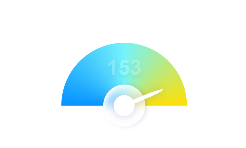
Imagine a sleek, colorful meter that looks like something straight out of a sci-fi movie dashboard. It’s got:
- A vibrant color wheel background
- A needle that moves to show different readings
- A digital display that updates in real-time
Sounds fun, right? Let’s break it down!
The Key Ingredients
We’re using the holy trinity of web development for this project:
- HTML: To structure our meter
- CSS: To make it look awesome
- JavaScript: To bring it to life with movement and real-time updates
How It Works
Here’s the cool stuff about our meter:
- The background is created using a conic gradient in CSS, giving us that sweet color wheel effect.
- We’ve got a semi-transparent knob at the bottom, complete with a realistic shadow effect.
- The needle is positioned on top of the knob and rotates to show different readings.
- JavaScript randomly generates new readings every 200 milliseconds, keeping things dynamic.
See the Pen Meter Animation with JS by CSLAB Software Development and Computer Training (@CSLAB) on CodePen.
HTML CODE :
<!-- The main container for the meter component -->
<div class="meter">
  <!-- Displays the current reading value -->
  <div class="reading">0</div>

  <!-- Container for the color wheel background -->
  <div class="colors-container">
    <div class="color-wheel">
    </div>
  </div>

  <!-- The knob and needle of the meter -->
  <div class="knob">
    <div class="needle">
      <div class="pointer"></div>
    </div>
  </div>
</div>

<!-- Commented out button for changing the reading manually -->
<!-- <button class="change-reading-btn">Change Reading</button> -->
CSS CODE :
/* Apply transition to all elements for smooth animations */
* {
  transition: all 0.2s;
}

/* Center the content in the middle of the viewport */
body {
  display: grid;
  place-content: center;
  height: 100vh;
  margin: 0px;
}

/* Style for the color wheel container */
.colors-container {
  height: 150px;
  overflow: hidden;
  width: 300px;
}

/* Create a colorful background using conic gradient */
.color-wheel {
  width: 300px;
  height: 300px;
  border-radius: 50%;
  background: conic-gradient(rgb(116,243,251), rgb(255,224,5) 90deg, rgb(5,147,255) 270deg, rgb(116,243,251));
}

/* Main container for the meter */
.meter {
  position: relative;
  width: 300px;
}

/* Style for the knob */
.knob {
  width: 100px;
  height: 100px;
  position: absolute;
  bottom: -50px;
  left: 100px;
  background: rgba(255,255,255,0.6);
  border-radius: 50%;
  box-shadow: 0px 5px 10px rgba(0,0,150,0.1),
    inset -5px 5px 10px rgba(255,255,255,1);
  backdrop-filter: blur(10px);
  display: grid;
  place-content: center;
  transform: rotate(-90deg);
}

/* Style for the needle */
.needle {
  background: #fff;
  width: 50px;
  height: 50px;
  border-radius: 50%;
  position: relative;
  transform: rotate(30deg);
  filter: drop-shadow(0px 0px 10px rgba(0,0,150,0.2));
  transition: all 0.3s;
}

/* Style for the pointer (part of the needle) */
div.pointer {
  background: #fff;
  height: 100px;
  width: 10px;
  position: absolute;
  bottom: 25px;
  left: 20px;
  border-radius: 50% 50% 0px 0px;
}

/* Style for the reading display */
.reading {
  font-size: 50px;
  position: absolute;
  width: 100%;
  text-align: center;
  color: #fff;
  text-shadow: 0px 5px 10px rgba(0,0,0,0.3);
  font-family: arial;
  font-weight: bold;
  opacity: 0.2;
  top: 30px;
}
JAVASCRIPT CODE :
// Select DOM elements
let changeReadingBtn = document.querySelector(".change-reading-btn");
let readingElement = document.querySelector(".reading");
let needle = document.querySelector(".needle");

// Uncomment this event listener to enable manual reading changes
// changeReadingBtn.addEventListener("click", () => {
//   changeReading();
// });

// Set an interval to change the reading every 200 milliseconds
setInterval(() => {
  changeReading();
}, 200);

// Function to change the reading and update the display
function changeReading() {
  // Generate a random reading between 0 and 180
  let newReading = parseInt(Math.random() * 181);
  console.log(newReading);

  // Update the reading display
  readingElement.innerText = newReading;

  // Rotate the needle to reflect the new reading
  needle.style.transform = `rotate(${newReading}deg)`;
}
The Magic Behind the Scenes
Let me share some of the coolest parts of our code:
- Color Wheel Magic:
background: conic-gradient(rgb(116,243,251), rgb(255,224,5) 90deg, rgb(5,147,255) 270deg, rgb(116,243,251));This single line creates our entire colorful background!
- Smooth Movements:
* { transition: all 0.2s; }This little trick ensures all our animations are butter-smooth.
- Real-time Updates:
   setInterval(() => {
     changeReading();
   }, 200);
This keeps our meter updating every 200 milliseconds, giving it that “live” feel.
Why This Project Rocks
- It’s a great way to practice combining HTML, CSS, and JavaScript.
- You’ll learn about cool CSS features like conic gradients and transitions.
- It introduces basic animation concepts using JavaScript.
- The end result looks professional and can be adapted for real-world applications!
So there you have it, folks! A quick dive into our interactive meter project. Remember, the key to mastering coding is practice and creativity. Don’t be afraid to tweak this project and make it your own!
Happy coding, and catch you in the next blog post! 🚀💻
— Vishnu Rajoria
Coding Instructor & Full Stack Developer
CSLAB Computer Institute, Sikar