Hey there! Vishnu Rajoria here, your friendly neighborhood coding instructor and Full Stack Developer at CSLAB Computer Institute in Sikar. Today, I’m excited to share a cool little project that’ll make your text come alive with a simple yet eye-catching animation.
What We’re Building
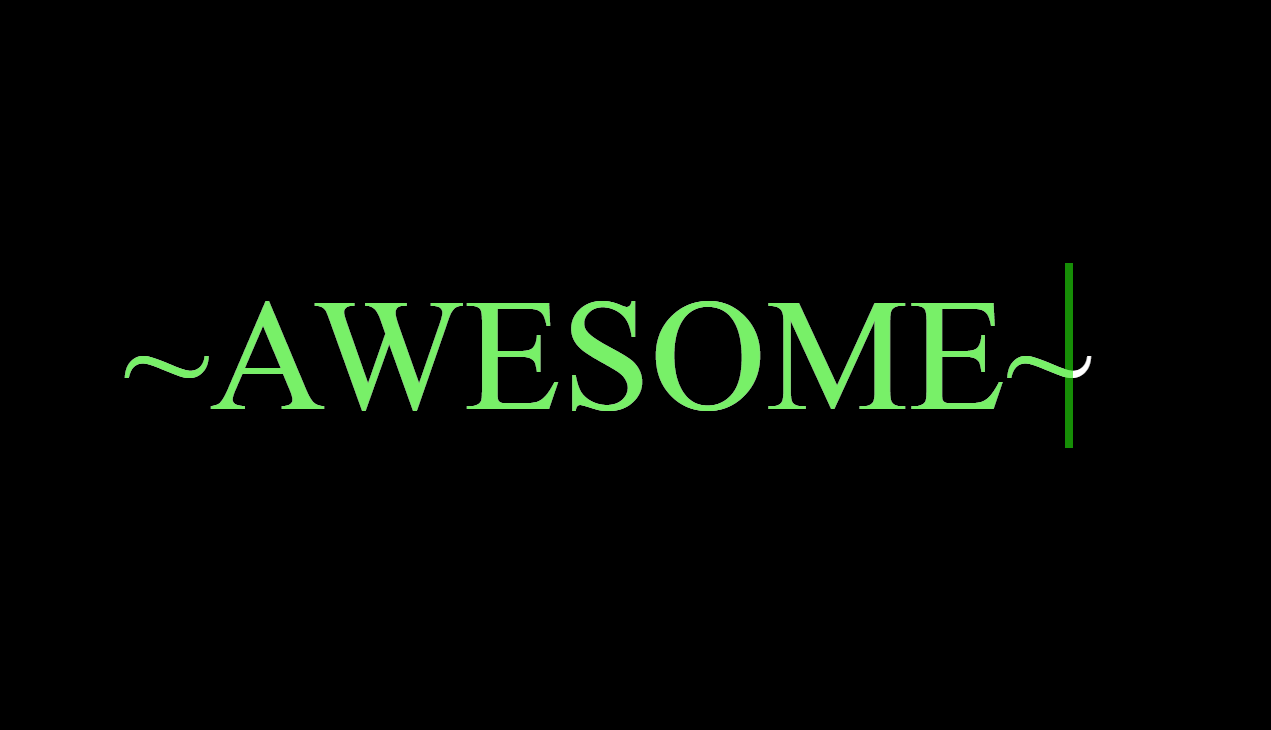
We’re creating a webpage with the word “awesome” that has a sleek animation effect. The text will appear to be typed out from left to right, then erased from right to left, in a continuous loop. It’s a great way to add some flair to your website!

The Key Components
Here’s what makes this animation tick:
- HTML Structure: A simple setup with a container and our text.
- CSS Magic: Where the real fun happens!
- Google Fonts: We’re using ‘Fredoka One’ for that extra punch.
See the Pen AWESOME HTML CSS by CSLAB Software Development and Computer Training (@CSLAB) on CodePen.
HTML CODE
<!DOCTYPE html>
<html lang="en">
<head>
    <meta charset="UTF-8">
    <meta http-equiv="X-UA-Compatible" content="IE=edge">
    <meta name="viewport" content="width=device-width, initial-scale=1.0">
    <title>animation</title>
    <link rel="stylesheet" href="./css/style.css">

</head>
<body>
<div class="container">
    <h1>~awesome~</h1>
</div>
</body>
</html>
CSS CODE
/* Reset default styles and set background color */
* {
    margin: 0;
    padding: 0;
    box-sizing: border-box;
    background-color: black;
}

/* Container for centering content */
.container {
    display: flex;
    justify-content: center;
    align-items: center;
    height: 100vh;
    width: 100vw;
}

/* Main heading styles */
h1 {
    color: white;
    font-size: 8rem;
    font-weight: normal;
    position: relative;
    text-transform: uppercase;
}

/* Create animated overlay effect */
h1::before {
    content: "~awesome~";
    width: 100%;
    position: absolute;
    color: #23e60a9d;
    top: 0;
    left: 0;
    border-right: 0.4rem solid #23e60a9d;
    animation: awesome 3s linear infinite;
    -webkit-animation: awesome 3s linear infinite;
    overflow: hidden;
}

/* Keyframes for animation */
@keyframes awesome {
    0% {
        width: 0%;
    }
    50% {
        width: 100%;
    }
    100% {
        width: 0%;
    }
}
The Cool Parts Explained
- Centering the Text:
- We use flexbox to center our text both vertically and horizontally.
- This ensures it looks great on any screen size.
- The Animation Effect:
- We create a pseudo-element (::before) that overlays our original text.
- This overlay has a different color and a right border that acts as our “cursor”.
- We animate the width of this overlay to create the typing effect.
- Keyframes Magic:
- The animation goes from 0% width to 100% and back to 0%.
- This creates the illusion of typing and erasing.
Why This is Awesome
- It’s pure CSS – no JavaScript required!
- It’s lightweight and easy to implement.
- You can customize colors and timing to fit your style.
Try It Yourself!
I encourage you to grab the code, play around with it, and make it your own. Change the text, tweak the colors, or adjust the animation speed. The possibilities are endless!
Remember, the best way to learn is by doing. So go ahead, get your hands dirty with some code, and create something awesome!
Happy coding, folks!