Hey there, fellow coders! Vishnu Rajoria here from CSLAB Computer Institute in Sikar. As a coding instructor and full-stack developer, I love sharing cool projects that can help you learn web development. Today, let’s dive into creating a sleek, functional clock using HTML, CSS, and JavaScript.
What We’re Building
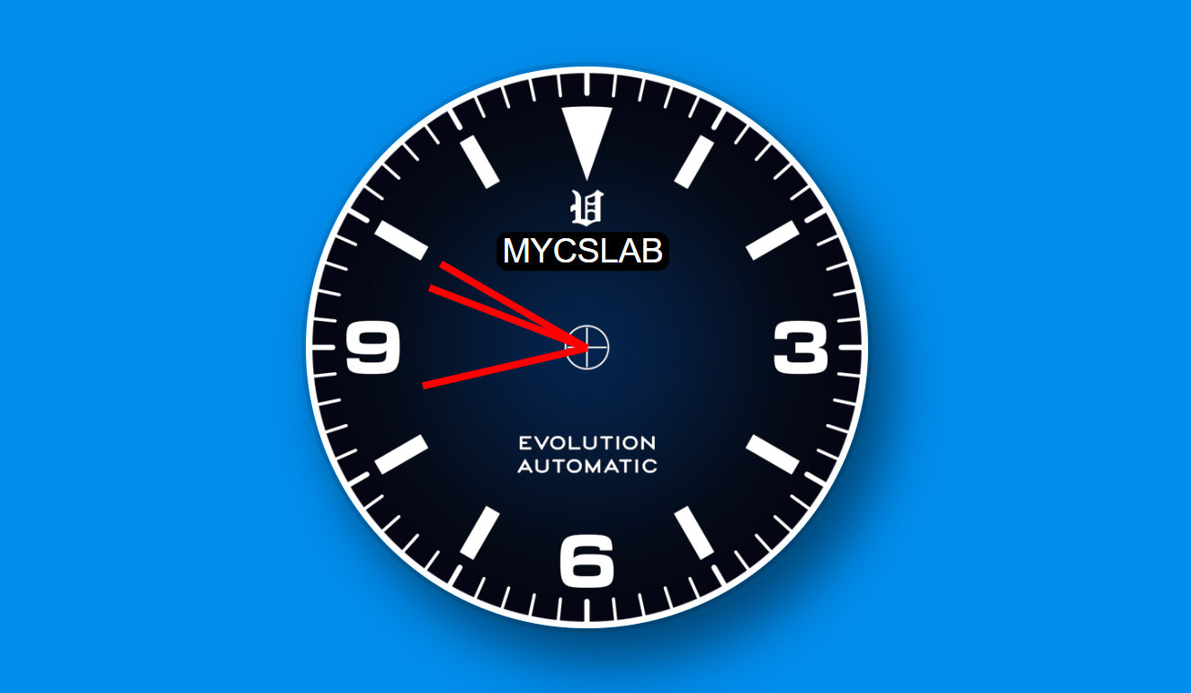
We’re going to create a digital clock that looks like an analog one. It’ll have:
- A round clock face
- Hour, minute, and second hands that move in real-time
- A custom background image
- Our institute’s logo (MYCSLAB) on the clock face
The Building Blocks
Here’s what each part of our code does:
- HTML:
- Creates the structure of our clock
- Defines divs for the clock face and hands
- CSS:
- Styles our clock to make it look awesome
- Positions the hands and logo
- Adds a cool background and some shadow effects
- JavaScript:
- Brings our clock to life
- Calculates the position of each hand based on the current time
- Updates the hand positions every second
See the Pen Analog Watch by CSLAB Software Development and Computer Training (@CSLAB) on CodePen.
HTML CODE
 <!-- Clock container -->
    <div class="clock">
        <div class="clock-face">
            <!-- Logo -->
            <div class="logo">MYCSLAB</div>
            <!-- Clock hands -->
            <div class="hand hour-hand"></div>
            <div class="hand min-hand"></div>
            <div class="hand second-hand"></div>
        </div>
    </div>
CSS CODE
  /* Global styles */
        html {
            background: #018DED;
            background-size: cover;
            font-family: 'helvetica neue', sans-serif;
            text-align: center;
            font-size: 10px;
        }

        body {
            margin: 0;
            font-size: 2rem;
            display: flex;
            flex: 1;
            min-height: 100vh;
            align-items: center;
        }

        /* Clock container styles */
        .clock {
            width: 30rem;
            height: 30rem;
            border-radius: 50%;
            margin: 50px auto;
            position: relative;
            padding: 100px;
            background: url("https://www.watchuseek.com/attachments/5342170/");
            background-size: cover;
            box-shadow:
                0 0 0 4px rgba(0,0,0,0.1),
                20px 30px 50px rgba(0,0,0,0.5);
        }

        /* Clock face styles */
        .clock-face {
            position: relative;
            width: 100%;
            height: 100%;
            transform: translateY(-3px); /* Adjust for the height of clock hands */
        }

        /* Clock hand styles */
        .hand {
            width: 50%;
            height: 6px;
            background: red;
            position: absolute;
            top: 50%;
            transform-origin: 100%;
            transform: rotate(90deg);
            transition: all 0.05s linear;
        }

        /* Logo styles */
        .logo {
            position: absolute;
            background: #000;
            padding: 0px 5px;
            font-size: 30px;
            top: 50px;
            left: 70px;
            color: #fff;
            border-radius: 10px;
        }
JAVASCRIPT CODE
        // Select clock hand elements
        const secondHand = document.querySelector('.second-hand');
        const minsHand = document.querySelector('.min-hand');
        const hourHand = document.querySelector('.hour-hand');

        function setDate() {
            const now = new Date();

            // Update second hand
            const seconds = now.getSeconds();
            const secondsDegrees = ((seconds / 60) * 360) + 90; // Convert to degrees, add 90 to offset default position
            secondHand.style.transform = `rotate(${secondsDegrees}deg)`;

            // Update minute hand
            const mins = now.getMinutes();
            const minsDegrees = ((mins / 60) * 360) + ((seconds/60)*6) + 90; // Include seconds for smoother movement
            minsHand.style.transform = `rotate(${minsDegrees}deg)`;

            // Update hour hand
            const hour = now.getHours();
            const hourDegrees = ((hour / 12) * 360) + ((mins/60)*30) + 90; // Include minutes for smoother movement
            hourHand.style.transform = `rotate(${hourDegrees}deg)`;
        }

        // Update clock every second
        setInterval(setDate, 1000);

        // Initial call to set clock hands
        setDate();
Key Points to Remember
- We use CSS transforms to rotate the clock hands
- The JavaScript
Dateobject helps us get the current time - We update the clock every second using
setInterval() - CSS transitions make the movement of the hands smooth
Why This Project is Great for Learning
- It combines HTML, CSS, and JavaScript in a practical way
- You’ll learn about manipulating DOM elements
- It’s a fun way to practice CSS positioning and transforms
- The project teaches you how to work with time in JavaScript
Remember, the best way to learn is by doing. Try building this clock yourself, and don’t be afraid to experiment with different styles or add new features!
Happy coding, everyone! If you’re in Sikar and want to learn more, come visit us at CSLAB Computer Institute. We’re always excited to help new developers grow their skills!