
Hey there! Vishnu Rajoria here from CSLAB Computer Institute in Sikar. As a coding instructor and full-stack developer, I love sharing simple yet effective web design techniques. Today, we’re diving into creating an animated game loading screen using just HTML and CSS. Let’s break it down!
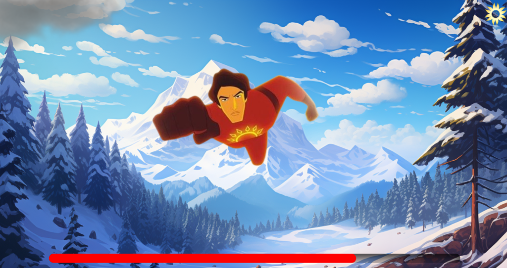
We’re building a loading screen with a mountain background, floating clouds, a bouncing character, and a progress bar. It’s a fun way to keep users engaged while your game loads.
Key Components:
- Background: A snowy mountain scene
- Logo: Rotating in the top-right corner
- Clouds: Moving across the screen
- Character: Bouncing up and down
- Loading Bar: Filling up from left to right
HTML Structure:
We’re using a simple div structure to organize our elements. Each component (logo, clouds, character, loading bar) has its own container, making it easy to style and animate.
CSS Magic:
Here’s where the fun begins! We’re using CSS animations to bring our loading screen to life. Here are the key techniques:
- Background: Set using background-image and cover the entire viewport.
- Animations: We’re using @keyframes for various animations:
• rotate-360: Spins the logo
• clouds-animation: Moves the clouds across the screen
• animate-character: Makes the character bounce
• progress-animation: Fills the loading bar - Positioning: Fixed positioning helps us place elements exactly where we want them.
- Overflow: We’re using overflow: hidden to keep things tidy.
See the Pen Animation example in CSS by CSLAB Software Development and Computer Training (@CSLAB) on CodePen.
HTML CODE
<!-- Main container for the animation -->
<div class="animation-container">
  <!-- Logo image -->
  <img class="logo" src="https://i.ibb.co/X73Pg9h/image-removebg-preview-20.png">

  <!-- Container for the moving clouds -->
  <div class="clouds-container">
    <img src="https://static.vecteezy.com/system/resources/thumbnails/012/595/172/small/realistic-white-cloud-png.png" alt="Cloud">
  </div>

  <!-- Container for the animated character -->
  <div class="charecter">
    <img src="https://i.ibb.co/yyRtpjN/036197549662b27e403ba42f72c6fb43-removebg-preview.png" alt="Character">
  </div>

  <!-- Loading bar container -->
  <div class="game-loading">
    <div class="progress"></div>
  </div>
</div>
CSS CODE
/* Global styles */
body {
  background: url("https://aipict.com/wp-content/uploads/2023/09/snowy-mountains01.png");
  background-size: cover;
  height: 100vh;
  width: 100vw;
  margin: 0px;
  overflow: hidden;
}

/* Animated box (not used in the HTML) */
.box {
  width: 200px;
  height: 200px;
  box-shadow: 0px 5px 10px rgba(0,0,0,0.3);
  animation: animate-shadow 1s infinite;
}

/* Shadow animation for the box */
@keyframes animate-shadow {
  0% {
    box-shadow: 0px 5px 10px rgba(0,0,0,0.3);
  }
  50% {
    box-shadow: 0px 0px 0px rgba(0,0,0,0.3);
  }
}

/* Character styles and animation */
.charecter {
  height: 220px;
  overflow: hidden;
  width: 370px;
  position: fixed;
  left: 30%;
  top: 30%;
  animation: animate-character 2s infinite;
}

.charecter img {
  margin-top: -220px;
  margin-left: -20px;
}

@keyframes animate-character {
  0% {
    top: 30%;
  }
  50% {
    top: 25%;
  }
}

/* Cloud container styles and animation */
.clouds-container {
  height: 320px;
  position: absolute;
  animation: clouds-animation 40s infinite;
  top: -200px;
}

.clouds-container img {
  width: 800px;
  margin-top: -100px;
}

@keyframes clouds-animation {
  0% {
    right: -1200px;
  }
  100% {
    right: 2000px;
  }
}

/* Logo styles and rotation animation */
.logo {
  position: fixed;
  right: 10px;
  top: 10px;
  width: 50px;
  z-index: 999;
  animation: rotate-360 3s infinite linear;
}

@keyframes rotate-360 {
  0% {
    transform: rotate(0deg);
  }
  100% {
    transform: rotate(360deg);
  }
}

/* Loading bar styles and animation */
.game-loading {
  position: fixed;
  width: 80%;
  bottom: 20px;
  left: 10%;
  border-radius: 50px;
  overflow: hidden;
  box-shadow: inset 0px 10px 20px rgba(0,0,0,0.8);
}

.progress {
  height: 20px;
  background: red;
  width: 0%;
  border-radius: 50px;
  animation: progress-animation 10s infinite;
}

@keyframes progress-animation {
  0% {
    width: 0%;
  }
  100% {
    width: 100%;
  }
}
Why This Matters:
A well-designed loading screen can:
- Reduce perceived wait time
- Increase user engagement
- Set the mood for your game
Remember, the key to great web design is creativity and attention to detail. This example shows how you can create something engaging with just HTML and CSS – no JavaScript required!
Want to learn more? Join us at CSLAB Computer Institute in Sikar, where we dive deep into web development and much more.
Keep coding, and stay curious!