Hey there! Vishnu Rajoria here, your friendly neighborhood coding instructor and Full Stack Developer from CSLAB Computer Institute in Sikar. Today, I’m going to walk you through creating a slick animated “Learn More” button using just HTML and CSS. It’s simpler than you might think!
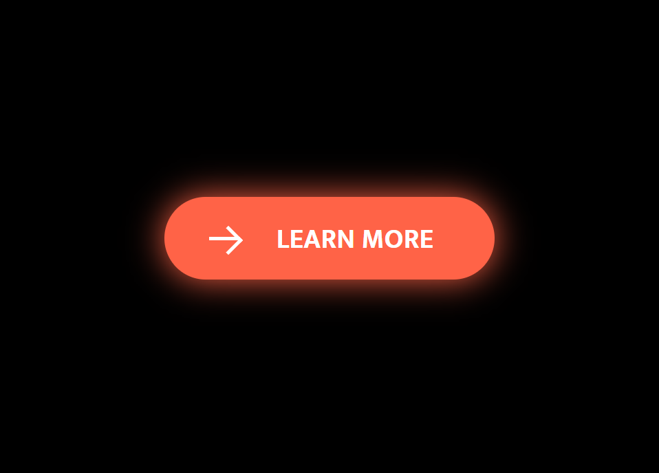
What We’re Building
We’re creating a button that expands and changes color when you hover over it. It’s a great way to add some interactivity to your website without using JavaScript.
The HTML Structure
Our HTML is pretty straightforward. Here are the key points:
- We’re using a
<button>element as our base - Inside the button, we have two
<span>elements:
- A circle that will expand on hover
- The button text (“Learn More”)
The CSS Magic
Here’s where the real fun begins! Let’s break down the important parts:
- We’re using CSS transitions for smooth animations
- The circular background starts small and expands on hover
- We create an arrow icon using CSS pseudo-elements
- The text color changes on hover
See the Pen ORANGE BUTTON ANIMATED HTML & CSS by CSLAB Software Development and Computer Training (@CSLAB) on CodePen.
HTML CODE
<!DOCTYPE html>
<html lang="en">
  <head>
    <meta charset="UTF-8" />
    <meta name="viewport" content="width=device-width, initial-scale=1.0" />
    <title>Button Animation</title>
    <!-- Link to external CSS file -->
    <link rel="stylesheet" href="css/style.css" />
  </head>
  <body>
    <!-- Animated "Learn More" button -->
    <button class="learn-more">
      <!-- Circular background for the arrow icon -->
      <span class="circle" aria-hidden="true">
        <!-- Arrow icon -->
        <span class="icon arrow"></span>
      </span>
      <!-- Button text -->
      <span class="button-text">Learn More</span>
    </button>
  </body>
</html>
CSS CODE
/* Import Mukta font from Google Fonts */
@import url("https://fonts.googleapis.com/css?family=Mukta:700");

/* Reset default styles and set box-sizing */
* {
  box-sizing: border-box;
  padding: 0;
  margin: 0;
}

/* Body styles */
body {
  font-family: "Mukta", sans-serif;
  font-size: 1rem;
  line-height: 1.5;
  display: flex;
  align-items: center;
  justify-content: center;
  min-height: 100vh;
  background: #000;
  overflow: hidden;
}

/* Base button styles */
button {
  position: relative;
  display: inline-block;
  cursor: pointer;
  outline: none;
  border: 0;
  vertical-align: middle;
  text-decoration: none;
  background: transparent;
  padding: 0;
  font-size: inherit;
  font-family: inherit;
}

/* "Learn More" button specific styles */
button.learn-more {
  width: 12rem;
  height: auto;
}

/* Circular background styles */
button.learn-more .circle {
  transition: all 0.45s;
  position: relative;
  display: block;
  margin: 0;
  width: 3rem;
  height: 3rem;
  background: tomato;
  border-radius: 1.625rem;
}

/* Icon base styles */
button.learn-more .circle .icon {
  transition: all 0.45s;
  position: absolute;
  top: 0;
  bottom: 0;
  margin: auto;
  background: #fff;
}

/* Arrow icon styles */
button.learn-more .circle .icon.arrow {
  transition: all 0.45s;
  left: 0.625rem;
  width: 1.125rem;
  height: 0.125rem;
  background: none;
}

/* Arrow icon before pseudo-element (creates arrowhead) */
button.learn-more .circle .icon.arrow::before {
  position: absolute;
  content: "";
  top: -0.25rem;
  right: 0.0625rem;
  width: 0.625rem;
  height: 0.625rem;
  border-top: 0.125rem solid #fff;
  border-right: 0.125rem solid #fff;
  transform: rotate(45deg);
}

/* Button text styles */
button.learn-more .button-text {
  transition: all 0.45s;
  position: absolute;
  top: 0;
  left: 0;
  right: 0;
  bottom: 0;
  padding: 0.75rem 0;
  margin: 0 0 0 1.85rem;
  color: tomato;
  font-weight: 700;
  line-height: 1.6;
  text-align: center;
  text-transform: uppercase;
}

/* Hover effects for the button */
button:hover .circle {
  width: 100%;
  box-shadow: 0 0 20px tomato;
}

button:hover .circle .icon.arrow {
  background: #fff;
  transform: translate(1rem, 0);
}

button:hover .button-text {
  color: #fff;
}
Key CSS Techniques
transition: all 0.45s;– This creates smooth animations for all changing propertiesposition: absolute;– Used to precisely position our elements::beforepseudo-element – Creates the arrowhead shape- CSS transforms – Rotate the arrow and move it on hover
Why This Matters
Adding these small interactive elements can really enhance user experience on your website. It provides visual feedback and makes your site feel more dynamic and engaging.
Wrapping Up
And there you have it! A simple yet effective animated button using pure CSS. Remember, the best way to learn is by doing. Try tweaking the colors, sizes, or even the animation timing to make it your own.
Happy coding, folks! If you want to dive deeper into web development, come visit us at CSLAB Computer Institute in Sikar. We’re always excited to help new developers grow their skills.
Got questions? Feel free to reach out to me at CSLAB. Happy coding, everyone!
Stay curious and keep coding! 👨💻✨