
Hey everyone! Vishnu Rajoria here, your friendly neighborhood coding instructor and Full Stack Developer from CSLAB Computer Institute in Sikar. Today, I want to walk you through creating a sleek, modern login form using HTML and CSS. Let’s dive in!
The Basics
We’re building a login form that’s not just functional, but also visually appealing. Here’s what makes it special:
- A cool animated gradient border
- Stylish input fields
- Responsive design
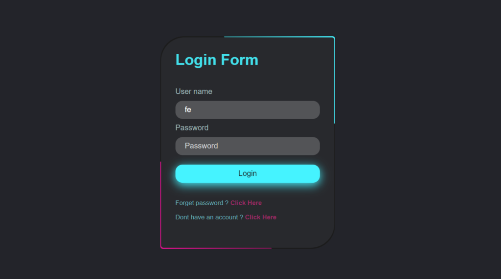
HTML Structure
The HTML is pretty straightforward. We’ve got:
- A main container (
<div class="box">) - A form with input fields for username and password
- Submit button
- Links for forgotten password and signup
The key here is keeping it simple and semantic. Each element has a purpose, making it easy to style and maintain.
CSS Magic
Now, here’s where the fun begins! Our CSS does a few cool things:
- Creates a centered layout using flexbox
- Adds a gradient border animation (trust me, it looks awesome!)
- Styles the input fields with a semi-transparent background
- Gives the submit button a glowing effect
See the Pen LOGIN FORM-BLACK&BLUE HTML & CSS by CSLAB Software Development and Computer Training (@CSLAB) on CodePen.
HTML CODE
<!DOCTYPE html>
<html lang="en">
  <head>
    <meta charset="UTF-8" />
    <meta name="viewport" content="width=device-width, initial-scale=1.0" />
    <title>Login Form</title>
    <!-- Link to external CSS file -->
    <link rel="stylesheet" href="css/style.css" />
  </head>
  <body>
    <!-- Main container for the login form -->
    <div class="box">
      <form>
        <!-- Title section -->
        <div class="title">
          <h1>Login Form</h1>
        </div>
        <!-- Input fields container -->
        <div class="input-box">
          <!-- Username input -->
          <label for="text" class="label-color">User name</label>
          <input
            id="text"
            name="text"
            type="text"
            placeholder="Username"
            required
          />
          <br />
          <!-- Password input -->
          <label for="password" class="label-color">Password</label>
          <input
            id="password"
            name="password"
            type="password"
            placeholder="Password"
            required
          />
          <br />
          <!-- Login button -->
          <input type="submit" class="Login" value="Login" />
          <br />
          <!-- Forgot password link -->
          <p class="link-text">Forget password ? <a href="#">Click Here</a></p>
          <!-- Sign up link -->
          <p class="link-text">
            Dont have an account ?
            <a href="#">Click Here</a>
          </p>
        </div>
      </form>
    </div>
  </body>
</html>
CSS CODE
/* Reset default styles and set font family */
* {
  padding: 0;
  margin: 0;
  box-sizing: border-box;
  font-family: "Poppins", sans-serif;
}

/* Center the content vertically and horizontally */
body {
  display: flex;
  justify-content: center;
  align-items: center;
  background-color: #23242a;
  height: 100vh;
}

/* Main container styles */
.box {
  position: relative;
  width: 370px;
  height: 450px;
  background: #1c1c1c;
  border-radius: 50px 5px;
  overflow: hidden;
}

/* Create animated gradient border effect */
.box::before,
.box::after {
  content: "";
  position: absolute;
  top: -50%;
  left: -50%;
  width: 370px;
  height: 450px;
  background: linear-gradient(60deg, transparent, #45f3ff, #45f3ff);
  transform-origin: bottom right;
  animation: animate 6s linear infinite;
}

.box::after {
  background: linear-gradient(60deg, transparent, #d9138a, #d9138a);
  animation-delay: -3s;
}

/* Keyframes for gradient animation */
@keyframes animate {
  0% {
    transform: rotate(0deg);
  }
  100% {
    transform: rotate(360deg);
  }
}

/* Form container styles */
form {
  position: absolute;
  inset: 2px;
  background: #28292d;
  border-radius: 50px 5px;
  z-index: 10;
  padding: 30px 30px;
  display: flex;
  flex-direction: column;
}

/* Title styles */
.title {
  width: 100%;
}

.title h1 {
  color: #45f3ff;
  justify-content: center;
  font-size: 2rem;
  font-weight: 600;
  opacity: 0.9;
  margin-bottom: 20px;
}

/* Input box styles */
form .input-box {
  width: 100%;
  margin-top: 20px;
}

form .input-box input {
  width: 100%;
  background-color: rgba(255, 255, 255, 0.2);
  border: none;
  outline: none;
  border-width: 3px;
  border-radius: 15px;
  padding: 10px 20px;
  font-size: 1rem;
  margin: 10px 0px 10px 0px;
  color: white;
}

form .input-box input::placeholder {
  color: #cdd1d2;
}

/* Submit button styles */
form .input-box input[type="submit"] {
  background-color: #45f3ff;
  cursor: pointer;
  color: #16100e;
  filter: drop-shadow(0 5px 10px #45f3ff);
  margin-bottom: 20px;
}

/* Link text styles */
form .link-text {
  padding-top: 15px;
  color: rgb(103, 173, 183);
  font-size: 0.85rem;
}

form .link-text a {
  text-decoration: none;
  color: rgb(153, 41, 99);
  font-weight: 700;
}

/* Label color */
.label-color {
  color: #9eb3b5;
}
Pro Tips
- Use pseudo-elements (::before and ::after) for the animated border. It adds depth without cluttering your HTML.
- Leverage CSS variables for colors. It makes tweaking the theme a breeze!
- Don’t forget about accessibility. Good color contrast and clear labels are crucial.
Why This Matters
As developers, we often focus on functionality. But remember, the user interface is the first thing people interact with. A well-designed login form can:
- Improve user experience
- Increase trust in your application
- Show attention to detail
Wrapping Up
This login form is just the beginning. You can build on this, add JavaScript for validation, or even integrate it with a backend. The possibilities are endless!
Remember, coding is all about creativity and problem-solving. Don’t be afraid to experiment and make it your own.
Happy coding, everyone! If you have any questions, feel free to reach out to me here at CSLAB Computer Institute in Sikar.
Got questions? Feel free to reach out to me at CSLAB. Happy coding, everyone!
Stay curious and keep coding! 👨💻✨