
Hey there! Vishnu Rajoria here from CSLAB Computer Institute in Sikar. As a coding instructor and full stack developer, I love sharing cool tricks that make websites pop. Today, let’s break down a simple yet eye-catching loading animation inspired by Google’s logo colors.
What We’re Building
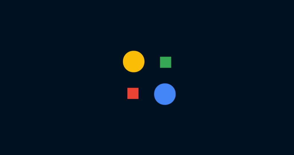
We’re creating a loading spinner with four circles that dance around in a square pattern. Each circle represents one of Google’s signature colors: blue, red, yellow, and green. It’s a fun way to keep users engaged while content loads!
The Magic Ingredients
Our animation uses just two ingredients:
- A pinch of HTML
- A dash of CSS magic
See the Pen Loader Animation by CSLAB Software Development and Computer Training (@CSLAB) on CodePen.
HTML CODE
<!-- HTML -->
<div class="container">
  <!-- Four spans representing animated elements -->
  <span class="one"></span>
  <span class="two"></span>
  <span class="three"></span>
  <span class="four"></span>
</div>
CSS CODE
/* CSS */

/* Reset default styles and use border-box sizing */
* {
  margin: 0;
  padding: 0;
  box-sizing: border-box;
}

/* Set up the body as a centered grid container */
body {
  background: #012;
  height: 100vh;
  display: grid;
  place-items: center;
}

/* Container for the animated elements */
.container {
  position: relative;
  width: 200px;
  height: 200px;
}

/* Common styles for all span elements */
span {
  position: absolute;
  display: block;
  width: 40%;
  height: 40%;
  border-radius: 50%;
  animation: speed 2s infinite ease-in-out;
}

/* Individual colors for each span, representing Google's logo colors */
.one {
  background: #4285f4; /* Google Blue */
  animation-delay: 1.5s;
}

.two {
  background: #ea4335; /* Google Red */
  animation-delay: 1s;
}

.three {
  background: #fbbc05; /* Google Yellow */
  animation-delay: 0.5s;
}

.four {
  background: #34a853; /* Google Green */
}

/* Keyframe animation for the moving circles */
@keyframes speed {
  0% {
    transform: translate(0%);
    border-radius: 50%;
  }
  25% {
    transform: translate(150%) scale(0.5);
    border-radius: 0%;
  }
  50% {
    transform: translate(150%, 150%);
    border-radius: 50%;
  }
  75% {
    transform: translate(0, 150%) scale(0.5);
    border-radius: 0%;
  }
}
Key Points to Remember
- We use four
<span>elements inside a container<div>to create our circles. - CSS positioning and animations do all the heavy lifting.
- The
animationproperty is our best friend here.
The Cool Parts Explained
- Circle Movement: We use the
transformproperty to move our circles around. - Shape Shifting: Our circles transform into squares and back using
border-radius. - Timing: Each circle starts its journey at a different time thanks to
animation-delay.
Why This Matters
As developers, it’s crucial to create engaging user experiences. Small touches like custom loading animations can:
- Reduce perceived wait times
- Add personality to your site
- Show attention to detail
Try It Yourself!
I encourage you to grab the code, tweak the colors, adjust the timing, and make it your own. Who knows? You might create the next trendy loading animation!
Remember, in web development, creativity and functionality go hand in hand. Keep experimenting, and don’t be afraid to add your personal touch to everything you create.
Happy coding, folks! 👨💻✨