Hey there! Vishnu Rajoria here, your friendly neighborhood coding instructor and Full Stack Developer from CSLAB Computer Institute in Sikar. Today, I want to share a neat little trick I use to create an eye-catching image transition effect using just HTML and CSS. It’s simpler than you might think, and it’ll add a touch of interactivity to your website that’s sure to impress.
What We’re Building
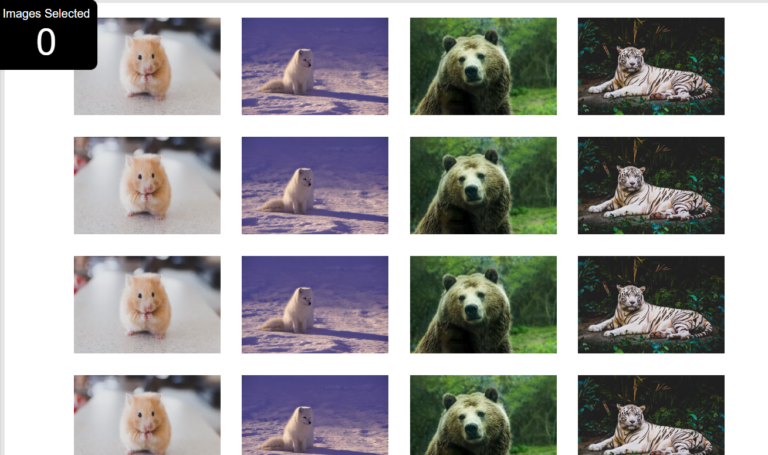
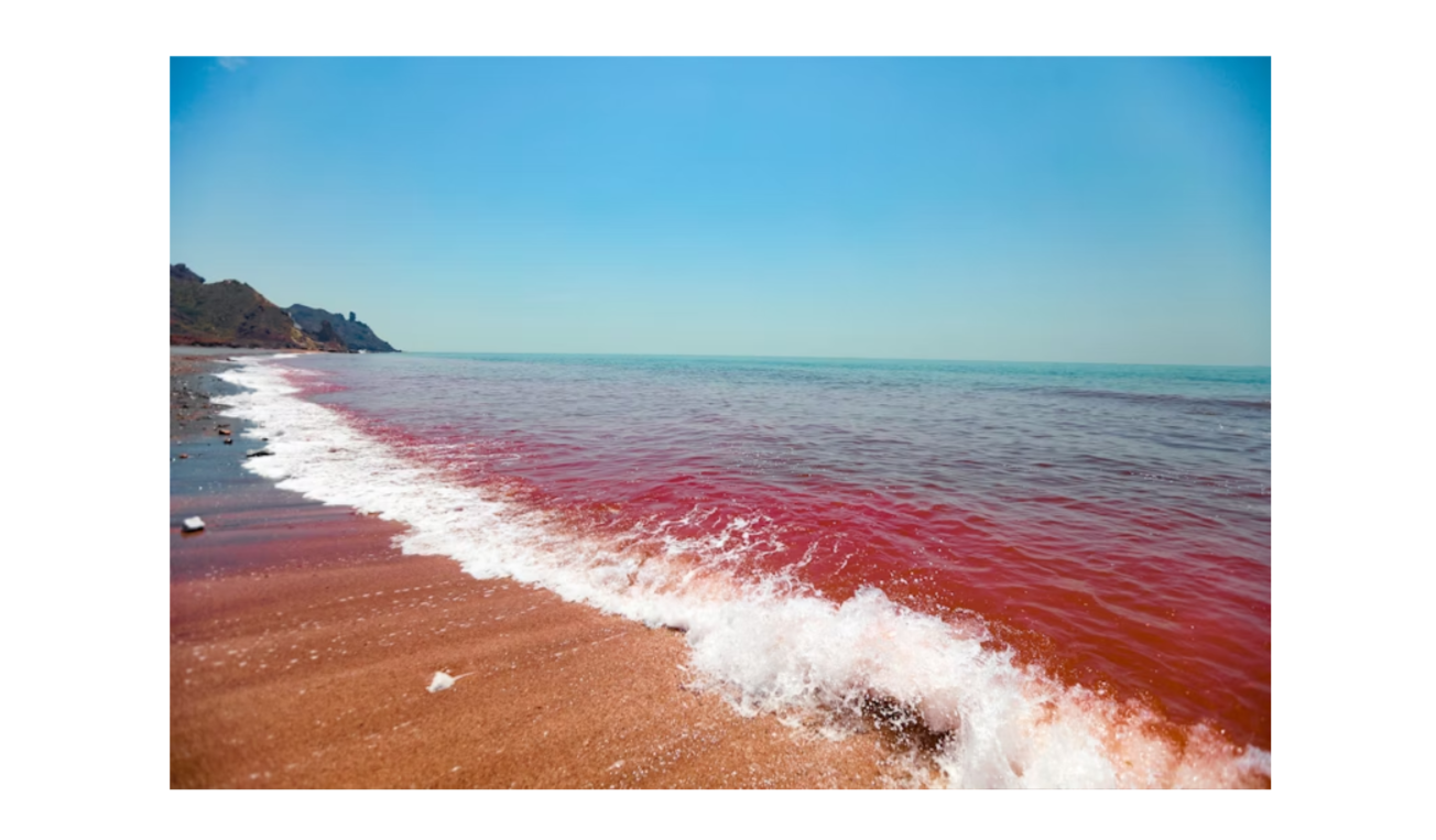
Imagine this: You hover over an image, and it smoothly transitions into a different image. Cool, right? That’s exactly what we’re going to create today.

The Key Ingredients
Here’s what we need:
- Two images (a “before” and “after” image)
- Some basic HTML
- A pinch of CSS magic
How It Works
The trick is to stack two images on top of each other and use CSS to reveal the second image when you hover over it. Here’s the breakdown:
- We set up two
<div>elements, each containing an image. - The first image is fully visible by default.
- The second image starts with a width of 0, making it invisible.
- When you hover over the container, we increase the width of the second image to 100%, revealing it.
- We add a transition effect to make it smooth and satisfying.
The Important Bits
Here are the crucial parts that make this work:
- HTML Structure: We use nested
<div>elements to create our image container. - CSS Positioning: We position our images absolutely within a relative container.
- CSS Transition: This is the real MVP. We use
transition: width 2s;to create that smooth reveal effect. - CSS Hover: The
:hoverpseudo-class triggers our transition when the mouse hovers over the container.
See the Pen image hover CSS by CSLAB Software Development and Computer Training (@CSLAB) on CodePen.
HTML CODE
<!DOCTYPE html>
<html lang="en">
<head>
    <meta charset="UTF-8">
    <meta name="viewport" content="width=device-width, initial-scale=1.0">
    <title>Image Transition Effect</title>
    <link rel="stylesheet" href="styles.css">
</head>
<body>
    <!-- Main container for the image transition effect -->
    <div class="container">
        <!-- First image (visible by default) -->
        <div class="imageBox imageBefore">
            <img src="https://images.unsplash.com/photo-1584346958348-ba29b401b526?ixid=MnwxMjA3fDB8MHxwaG90by1wYWdlfHx8fGVufDB8fHx8&ixlib=rb-1.2.1&auto=format&fit=crop&w=800&q=80" alt="Before image">
        </div>
        <!-- Second image (revealed on hover) -->
        <div class="imageBox imageAfter">
            <img src="https://images.unsplash.com/photo-1591089524226-d5d432530307?ixlib=rb-1.2.1&ixid=MnwxMjA3fDB8MHxwaG90by1wYWdlfHx8fGVufDB8fHx8&auto=format&fit=crop&w=800&q=80" alt="After image">
        </div>
    </div>
</body>
</html>
CSS CODE
body {
  margin: 0;
  padding: 0;
}
.container {
  position: absolute;/* Reset default margin and padding */
body {
  margin: 0;
  padding: 0;
}

/* Container for the image transition effect */
.container {
  position: absolute;
  top: 50%;
  left: 50%;
  transform: translate(-50%, -50%);
  width: 800px;
  height: 533px;
}

/* Common styles for both image boxes */
.imageBox {
  position: absolute;
  top: 0;
  left: 0;
}

/* Styles for the second image (revealed on hover) */
.imageAfter {
  width: 0;
  transition: width 2s; /* Smooth transition for width change */
  overflow: hidden; /* Hide overflow during transition */
}

/* Hover effect to reveal the second image */
.container:hover .imageAfter {
  width: 100%;
}
  top: 50%;
  left: 50%;
  transform: translate(-50%, -50%);
  width: 800px;
  height: 533px;
}
.imageBox {
  position: absolute;
  top: 0;
  left: 0;
}
.imageAfter {
  width: 0;
  transition: 2s;
  overflow: hidden;
}
.container:hover .imageAfter {
  width: 100%;
}
Why It’s Awesome
- It’s pure CSS – no JavaScript required!
- It’s lightweight and fast.
- It adds a dynamic element to your site without being overwhelming.
- It’s a great way to showcase before-and-after scenarios or product variations.
So there you have it, folks! A simple yet effective way to add some pizzazz to your website. Give it a try, and feel free to tweak the transition speed or add your own spin to it. Happy coding!