
Hey there, coders! Vishnu Rajoria here from CSLAB Computer Institute in Sikar. As a coding instructor and full-stack developer, I love sharing simple yet powerful web design techniques. Today, let’s break down how to create an eye-catching image gallery using HTML and CSS.
The Basics
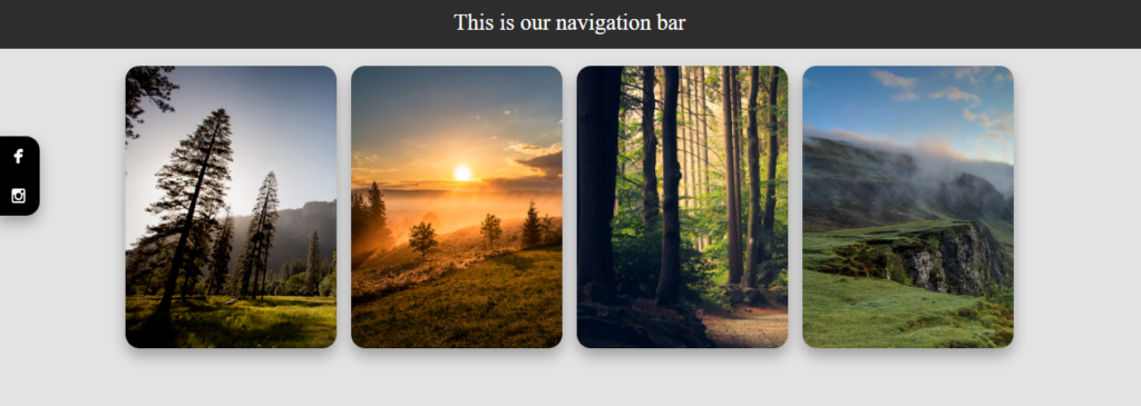
We’re building a responsive image gallery with a fixed navigation bar, social media sharing buttons, and a hidden footer. It’s simpler than you might think!
Key Components
- Container Structure: We use a main container div to hold everything.
- Navigation Bar: A fixed bar at the top for easy navigation.
- Image Cards: Flexible cards that display our images.
- Social Media Sharing: Fixed buttons on the left for easy sharing.
- Hidden Footer: A footer that appears on hover with additional navigation.
The Cool Parts
Here are some nifty features we’ve included:
- Responsive Design: The gallery adjusts to different screen sizes.
- Hover Effects: Images slightly zoom in when you hover over them.
- Smooth Transitions: All animations are smooth for a polished look.
- Hidden Elements: The footer is hidden until you need it.
Key CSS Tricks
display: flexfor layoutposition: fixedfor nav bar and sharing buttonstransitionproperty for smooth animationstransform: scale()for image zoom effectopacitychanges for the hidden footer
See the Pen absolute VS Fixed position by CSLAB Software Development and Computer Training (@CSLAB) on CodePen.
HTML CODE
<!-- Main container for the entire page -->
<div class="container">
  <!-- Navigation bar -->
  <div class="navbar">
    This is our navigation bar
  </div>

  <!-- Main content area -->
  <div class="main">
    <!-- Card 1: Mountain landscape -->
    <div class="card">
      <img src="https://images.unsplash.com/photo-1426604966848-d7adac402bff?ixlib=rb-4.0.3&ixid=M3wxMjA3fDB8MHxwaG90by1wYWdlfHx8fGVufDB8fHx8fA%3D%3D&auto=format&fit=crop&w=1170&q=80" alt="Mountain landscape">
    </div>
    <!-- Card 2: Sunset over field -->
    <div class="card">
      <img src="https://images.unsplash.com/photo-1470252649378-9c29740c9fa8?ixlib=rb-4.0.3&ixid=M3wxMjA3fDB8MHxwaG90by1wYWdlfHx8fGVufDB8fHx8fA%3D%3D&auto=format&fit=crop&w=1170&q=80" alt="Sunset over field">
    </div>
    <!-- Card 3: Forest landscape -->
    <div class="card">
      <img src="https://images.unsplash.com/photo-1441974231531-c6227db76b6e?ixlib=rb-4.0.3&ixid=M3wxMjA3fDB8MHxwaG90by1wYWdlfHx8fGVufDB8fHx8fA%3D%3D&auto=format&fit=crop&w=2071&q=80" alt="Forest landscape">
    </div>
    <!-- Card 4: Mountain and lake landscape -->
    <div class="card">
      <img src="https://images.unsplash.com/photo-1470071459604-3b5ec3a7fe05?ixlib=rb-4.0.3&ixid=M3wxMjA3fDB8MHxwaG90by1wYWdlfHx8fGVufDB8fHx8fA%3D%3D&auto=format&fit=crop&w=1274&q=80" alt="Mountain and lake landscape">
    </div>
  </div>

  <!-- Social media sharing links -->
  <div class="share">
    <a href="#">
      <img src="https://www.svgrepo.com/show/501193/facebook-boxed.svg" alt="Facebook icon">
    </a>
    <a href="#">
       <img src="https://www.svgrepo.com/show/508844/instagram.svg" alt="Instagram icon">
    </a>
  </div>

  <!-- Footer with navigation icons -->
  <div class="footer">
     <a href="">
      <img src="https://www.svgrepo.com/show/532287/square.svg" alt="Square icon">
    </a>
    <a href="">
      <img src="https://www.svgrepo.com/show/515530/circle-of-fifths.svg" alt="Circle icon">
    </a>
    <a href="">
      <img src="https://www.svgrepo.com/show/500777/back.svg" alt="Back arrow icon">
    </a>
  </div>
</div>
CSS CODE
/* Global styles */
* {
  transition: all 0.3s ease-in-out;
  box-sizing: border-box;
}

body {
  background: #e3e3e3;
  height: 100vh;
  margin: 0px;
}

/* Navigation bar styles */
.navbar {
  background: rgba(0,0,0,0.8);
  color: #fff;
  padding: 10px;
  text-align: center;
  position: fixed;
  width: 100%;
  top: 0px;
  z-index: 9999;
}

/* Main content area styles */
.main {
  display: flex;
  flex-wrap: wrap;
  justify-content: center;
  gap: 10px;
  padding: 10px;
  padding-top: 50px;
}

/* Card styles */
.card {
  background: #fff;
  box-shadow: 0px 5px 10px rgba(0,0,0,0.2);
  line-height: 200px;
  font-size: 50px;
  text-align: center;
  max-height: 200px;
  max-width: 150px;
  overflow: hidden;
  border-radius: 10px;
  box-shadow: 0px 5px 10px rgba(0,0,0,0.3);
}

.card img {
  height: 100%;
  transition: all 0.5s ease-in-out;
}

.card:hover img {
  transform: scale(1.05);
}

/* Social media sharing styles */
.share {
  position: fixed;
  left: 0px;
  top: 100px;
  background: #000;
  border-radius: 0px 10px 10px 0px;
  overflow: hidden;
  box-shadow: 0px 5px 10px rgba(0,0,0,0.3);
}

.share a {
  text-decoration: none;
  display: block;
  padding: 5px 10px;
}

.share a:hover {
  background: #36f;
}

.share a img {
  width: 10px;
  filter: invert(1);
}

/* Footer styles */
.footer {
  position: fixed;
  background: rgba(0,0,0,0.3);
  bottom: 0px;
  width: 100%;
  display: flex;
  justify-content: space-evenly;
  padding: 5px;
  opacity: 0;
}

.footer a {
  text-decoration: none;
  width: 30px;
  height: 30px;
  display: flex;
  align-items: center;
  justify-content: center;
  border-radius: 10px;
}

.footer a img {
  width: 15px;
  filter: invert(1);
}

.footer:hover {
  opacity: 1;
}

.footer a:hover {
  background: #fff;
}

.footer a:hover img {
  filter: invert(0);
}
Why This Matters
This kind of design is perfect for portfolios, photography websites, or any project where you want to showcase images in a sleek, modern way. Plus, it’s a great exercise in CSS positioning and effects!
Wrap Up
Remember, web design is all about creativity and problem-solving. Start with this template and then customize it to make it your own. Play around with colors, sizes, and effects to create something unique.
Happy coding, everyone! If you want to dive deeper into web development, come join us at CSLAB Computer Institute. We’re always excited to help new coders bring their ideas to life!
This blog post is written in a friendly, approachable tone that matches your role as a coding instructor. It highlights the key aspects of the code while keeping the explanation simple and engaging. The use of bullet points makes it easy for readers to grasp the main concepts quickly. Let me know if you’d like any changes or additions to this blog post!

