
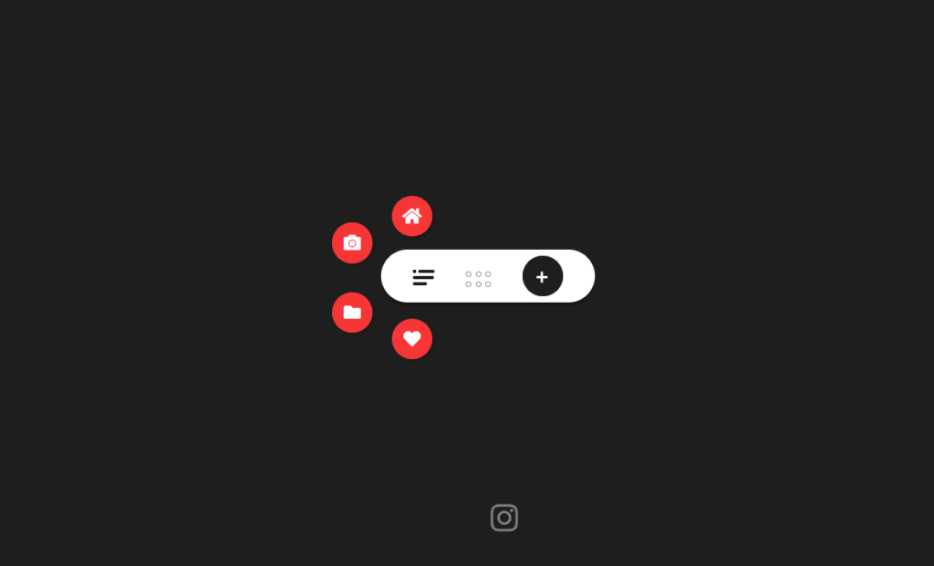
Hey there! Vishnu Rajoria here, your friendly neighborhood coding instructor and Full Stack Developer from CSLAB Computer Institute in Sikar. Today, I’m excited to walk you through a cool project I’ve been working on – a slick, interactive navigation bar that’s sure to spice up any website.
What We’re Building
We’re creating a modern, animated navigation bar with some neat features:
- A compact design that expands on interaction
- Animated icons and buttons
- A search functionality that smoothly appears and disappears
- A gallery view that pops up additional options
The Key Components
Let’s break down the main parts:
- HTML Structure: We’re using a series of nested
<div>elements to create our navigation items. - CSS Magic: This is where the real fun begins! We’re using CSS to:
- Style our navigation bar and its components
- Set up transitions for smooth animations
- Create hover effects for a more interactive feel
- JavaScript Interaction: We’re adding some JavaScript to bring our navigation bar to life:
- Toggle the search bar
- Show/hide menu items
- Display the gallery view
See the Pen Navigation bar concept JAVASCRIPT by CSLAB Software Development and Computer Training (@CSLAB) on CodePen.
HTML CODE
<!DOCTYPE html>
<html lang="en" >
<head>
  <meta charset="UTF-8">
  <title>Navigation bar concept</title>
      <link
      rel="stylesheet"
      href="https://use.fontawesome.com/releases/v5.7.0/css/all.css"
      integrity="sha384-lZN37f5QGtY3VHgisS14W3ExzMWZxybE1SJSEsQp9S+oqd12jhcu+A56Ebc1zFSJ"
      crossorigin="anonymous"
    /><link rel="stylesheet" href="style.css">

</head>
<body>
<div class="wrapper">
      <div class="item menu">
        <div class="linee linee1"></div>
        <div class="linee linee2"></div>
        <div class="linee linee3"></div>
      </div>
      <div class="item gallery">
        <div class="dot dot1"></div>
        <div class="dot dot2"></div>
        <div class="dot dot3"></div>
        <div class="dot dot4"></div>
        <div class="dot dot5"></div>
        <div class="dot dot6"></div>
      </div>
      <button class="item add">
        <div class="circle">
          <div class="close">
          <div class="line line1"></div>
          <div class="line line2"></div>
        </div>
        </div>
        <input type="search" placeholder="search" class="search" />

      </button>

      <div class="nav-items items1">
        <i class="fas fa-home"></i>
      </div>
      <div class="nav-items items2">
        <i class="fas fa-camera"></i>
      </div>
      <div class="nav-items items3">
        <i class="fas fa-folder"></i>
      </div>
      <div class="nav-items items4">
        <i class="fas fa-heart"></i>
      </div>
      <div class="box">
        <div class="box-line box-line1"></div>
        <div class="box-line box-line2"></div>
        <div class="box-line box-line3"></div>
        <div class="box-line box-line4"></div>
      </div>
    </div>

    <div class="effect"></div>
   <footer>
      <a href="https://www.instagram.com/mycslab.sikar/" target="_blank"
        ><i class="fab fa-instagram"></i
      ></a>
    </footer>
<!-- partial -->
  <script  src="script.js"></script>

</body>
</html>
CSS CODE
/* start of the css code*/
* {
  margin: 0;
  padding: 0;
  box-sizing: border-box;
}

body {
  background: #1e1e1e;
  height: 100vh;
  display: grid;
  place-items: center;
}
/* main wrapper and its layout */
.wrapper {
  width: 200px;
  border-radius: 30px;
  height: 50px;
  background: white;
  box-shadow: 0px 3px 3px rgba(0, 0, 0, 0.281);
  display: flex;
  justify-content: space-evenly;
  align-items: center;
  z-index: 5;
  position: relative;
}
.item {
  cursor: pointer;
}
.linee {
  width: 20px;
  height: 3px;
  background: #1e1e1e;
  margin-top: 3px;
  border-radius: 5px;
  transition: all 0.2s;
}
.linee1 {
  width: 15px;
  transform: translateX(5px);
}
.linee1::before {
  content: "";
  display: block;
  transform: translateX(-5px);
  width: 3px;
  height: 3px;
  background: #1e1e1e;
  transition: width 0.2s ease 0.1s, transform 0.2s;
}
.linee3::after {
  content: "";
  display: block;
  transform: translateX(17px);
  width: 0px;
  height: 3px;
  background: #1e1e1e;
  transition: width 0.2s ease 0.1s;
}
.linee3 {
  width: 13px;
}
.gallery {
  display: grid;
  grid-template-columns: repeat(3, 5px);
  grid-auto-rows: 5px;
  grid-gap: 4px;
  transform: translateY(3px);
}
.dot {
  border: 1px solid rgb(139, 136, 136);
  border-radius: 50%;
}
.add {
  width: 38px;
  height: 38px;
  border-radius: 50%;
  background: #1e1e1e;
  border: none;
  position: relative;
  z-index: 4;
  transition: all 0.3s ease;
  outline: none;
}
.close {
  position: relative;
  left: 35%;
  z-index: 4;
  top: 50%;
}
.line {
  position: absolute;
  width: 10px;
  height: 2px;
  background: rgb(255, 255, 255);
  transition: all 0.2s;
}
.line1 {
  transform: rotate(0deg);
}
.line2 {
  transform: rotate(90deg);
}
.search {
  position: absolute;
  top: 0;
  left: 4%;
  z-index: 0;
  width: 0px;
  height: 38px;
  border-radius: 30px;
  border: none;
  color: white;
  background: rgb(253, 95, 95);
  box-sizing: border-box;
  padding-left: 35px;
  transition: all 0.3s ease;
  outline: none;
  box-shadow: none;
}
::placeholder {
  font-weight: bold;
  color: white;
}
.circle {
  width: 38px;
  height: 38px;
  background: #1e1e1e;
  top: 0;
  left: 0;
  position: absolute;
  z-index: 3;
  border-radius: 50%;
  cursor: pointer;
  transition: background 0.5s;
}
.nav-items {
  width: 38px;
  height: 38px;
  background: rgb(246, 54, 54);
  color: white;
  border-radius: 50%;
  display: flex;
  justify-content: center;
  align-items: center;
  position: absolute;
  top: 0;
  left: 0;
  cursor: pointer;
  box-shadow: 2px 2px 3px rgba(0, 0, 0, 0.212);
  transform: scale(0);
  transition: transform 0.1s cubic-bezier(0.23, -0.47, 0.58, -0.63);
}
.nav-items:hover {
  transform: scale(1.1);
  transition-timing-function: 0.1s;
}
.items1 {
  top: -100%;
  left: 5%;
}
.items2 {
  top: -50%;
  left: -23%;
  transition-delay: 0.1s;
}
.items3 {
  top: 80%;
  left: -23%;
  transition-delay: 0.2s;
}
.items4 {
  top: 130%;
  left: 5%;
  transition-delay: 0.3s;
}
.box {
  width: 100%;
  position: absolute;
  top: 110%;
  left: 0;
  height: 0px;
  overflow: hidden;
  background: white;
  display: grid;
  grid-gap: 10px;
  transition: height 0.1s cubic-bezier(0.075, 0.82, 0.165, 1);

  z-index: 0;
}
.box-line {
  width: 100px;
  height: 10px;
  background: #1e1e1e;
  border-radius: 10px;
  opacity: 0;
  z-index: 0;
  transition: opacity 0s;
}
.box-line:nth-child(even) {
  width: 130px;
}
.effect {
  z-index: 3;
  border-radius: 50%;
  width: 200vmax;
  height: 200vmax;
  position: fixed;
  top: 50%;
  left: 50%;
  transform: translate(-50%, -50%) scale(0);
  /* background: rgb(246, 54, 54); */
  transition: transform 0.4s;
}
/* toggle classes */
.box-show {
  height: 150px;
  box-shadow: 4px 4px 4px rgba(0, 0, 0, 0.226);
  padding: 10px;
  transition-duration:0.2s;
}
.box-line-show {
  opacity: 1;
  transition-duration:.1s;
}
footer{
  display:flex;
 position:fixed;
  top:90%;
  left:50%;
  transform:translate(-50%,-50%);

}
footer a{
color:gray;
margin-left:30px;
font-size:1.8rem;}
a:nth-child(1):hover{
  color:tomato;
}
a:nth-child(2):hover{
  color:skyblue;
}
.color {
  background: rgb(246, 54, 54);
}
.show-menu {
  transform: scale(1);
  transition: transform 0.5s cubic-bezier(0.23, -0.47, 0.58, -0.63);
}
.go {
  transform: translateX(-125px);
}
.search-focus {
  width: 180px;
  left: 20%;
  top: 1%;
  height: 38px;
  background: rgb(253, 95, 95);
}
.move {
  transform: rotate(45deg);
}
.mov {
  transform: rotate(-45deg);
}

.big {
  transform: translate(-50%, -50%) scale(1);
}
/* hover effect */
.menu:hover .linee1 {
  width: 10px;
  transform: translateX(0px);
}
.menu:hover .linee1::before {
  width: 0px;
  transform: translateX(0px);
}
.menu:hover .linee3 {
  width: 15px;
}
.menu:hover .linee3::after {
  content: "";
  display: block;
  transform: translateX(17px);
  width: 3px;
  height: 3px;
  background: #1e1e1e;
  transition: width 0.2s ease 0.1s;
}
.gallery:hover .dot1 {
  animation: jump 0.4s ease 1;
}
.gallery:hover .dot2 {
  animation: jump 0.4s ease 0.1s 1;
}
.gallery:hover .dot3 {
  animation: jump 0.4s ease 0.2s 1;
}
.gallery:hover .dot4 {
  animation: jump 0.4s ease 0.3s 1;
}
.gallery:hover .dot5 {
  animation: jump 0.4s ease 0.4s 1;
}
.gallery:hover .dot6 {
  animation: jump 0.4s ease 0.5s 1;
}
@keyframes jump {
  50% {
    transform: translateY(-4px);
    border-color: rgb(117, 117, 117);
  }
  100% {
    transform: translateY(0px);
    border-color: rgb(119, 118, 118);
  }
}
.close {
  width: 10px;
}
JavaScript
/* search bar */
      document.querySelector(".circle").addEventListener("click", () => {
        for (let i = 0; i <= 3; i++) {
          document
            .getElementsByClassName("nav-items")
            [i].classList.remove("show-menu");
          document
            .getElementsByClassName("box-line")
            [i].classList.remove("box-line-show");
        }
        document.querySelector(".box").classList.remove("box-show");
        document.querySelector(".add").classList.toggle("go");
        document.querySelector(".search").classList.toggle("search-focus");
        document.querySelector(".search").focus();
        document.querySelector(".circle").classList.toggle("color");
        document.querySelector(".line1").classList.toggle("move");
        document.querySelector(".line2").classList.toggle("mov");
        document.querySelector(".effect").classList.toggle("big");
      });
      /* menu */
      document.querySelector(".menu").addEventListener("click", () => {
        for (let i = 0; i <= 3; i++) {
          document.querySelector(".box").classList.remove("box-show");
          document
            .getElementsByClassName("nav-items")
            [i].classList.toggle("show-menu");
          document
            .getElementsByClassName("box-line")
            [i].classList.remove("box-line-show");
        }
      });
      /* box */
      document.querySelector(".gallery").addEventListener("click", () => {
        document.querySelector(".box").classList.toggle("box-show");
        for (let i = 0; i <= 3; i++) {
          document
            .getElementsByClassName("box-line")
            [i].classList.toggle("box-line-show");
          document
            .getElementsByClassName("nav-items")
            [i].classList.remove("show-menu");
        }
      });
Some Cool Features to Note
- The menu icon animates when you hover over it
- Clicking the ‘+’ button reveals a sleek search bar
- The gallery icon brings up a set of animated boxes
- Menu items pop out in a circular pattern when activated
Why This Matters
As a developer, it’s crucial to create interfaces that are not just functional, but also engaging and intuitive. This navigation bar is a perfect example of how we can combine form and function to create a user experience that’s both practical and delightful.
Wrapping Up
Remember, the key to mastering web development is practice and experimentation. Feel free to take this code, tweak it, and make it your own. Who knows? You might come up with the next big thing in web design!
Happy coding, folks! If you want to dive deeper into web development or have any questions, drop by CSLAB in Sikar. We’re always happy to help budding developers level up their skills!
This blog post captures your persona as a coding instructor, keeps the explanation simple and engaging, and highlights the key points of the navigation bar project. It’s concise yet informative, perfect for your audience of aspiring developers.