Hey there, coding enthusiasts! Vishnu Rajoria here, your friendly neighborhood coding instructor and Full Stack Developer from CSLAB Computer Institute in Sikar. Today, I’m excited to walk you through creating a sleek, modern navbar using HTML and CSS. Let’s dive in!
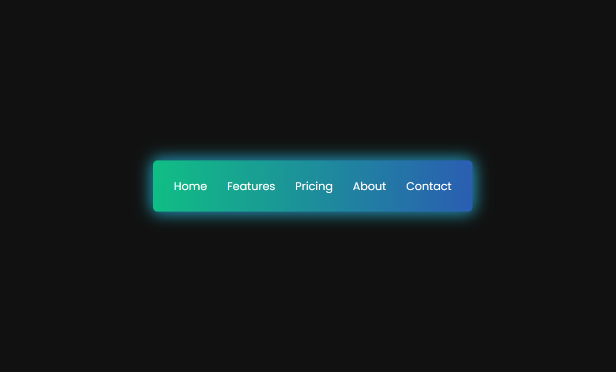
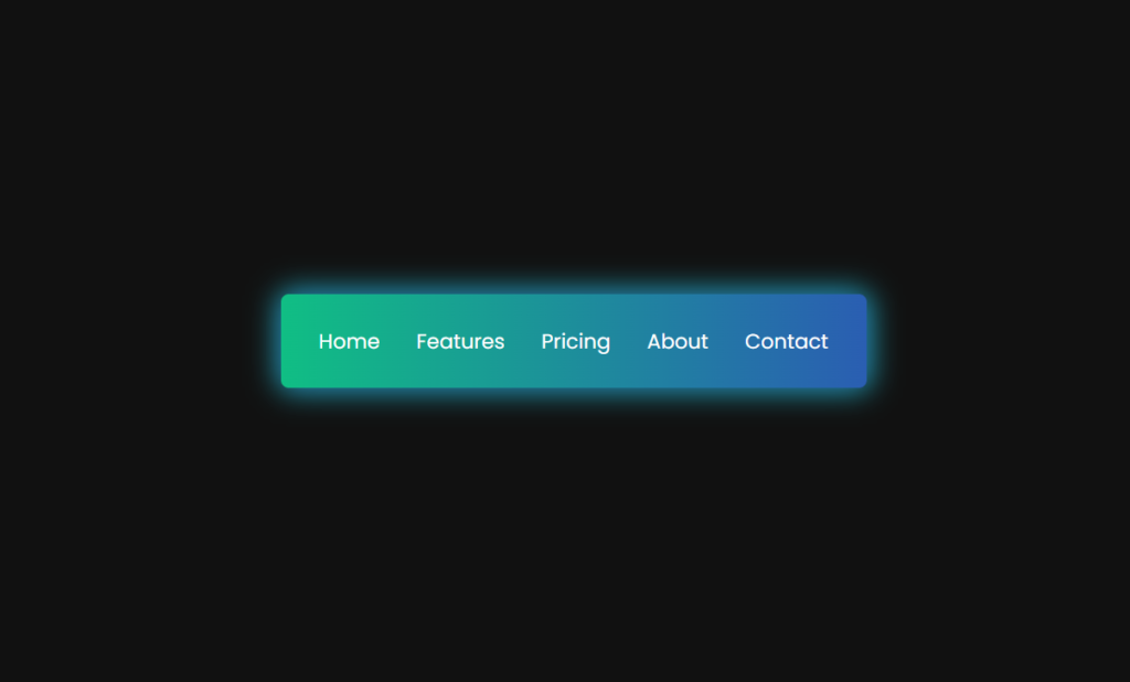
What We’re Building
We’re going to create a horizontal navbar with a gradient background and a cool hover effect. It’s simple, elegant, and perfect for spicing up your website’s navigation.
The Building Blocks
Our navbar consists of two main parts:
- HTML structure
- CSS styling
HTML Structure
The HTML is straightforward. We’re using an unordered list (<ul>) inside a <nav> element. Each list item is a link to a different page.
Key points:
- We use semantic HTML with the
<nav>tag - Each menu item is a list item with a class of “link”
- We’re keeping it simple with just five menu items
CSS Magic
This is where the real fun begins! Here’s what makes our navbar special:
- Gradient Background: We use a linear gradient for the navbar background, giving it a modern, colorful look.
- Flexbox Layout: This helps us easily center and space out our menu items.
- Hover Effect: We create a slick underline effect that expands from the center when you hover over a menu item.
See the Pen CodePen Home COLOR NAV-BAR HTML & CSS by CSLAB Software Development and Computer Training (@CSLAB) on CodePen.
HTML CODE
<!DOCTYPE html>
<html lang="en">
  <head>
    <meta charset="UTF-8" />
    <meta name="viewport" content="width=device-width, initial-scale=1.0" />
    <title>GevStack - NavBar</title>
    <!-- Link to external CSS file -->
    <link rel="stylesheet" href="css/style.css" />
  </head>
  <body>
    <!-- Navigation bar -->
    <nav>
      <ul>
        <!-- Navigation menu items -->
        <li class="link">
          <a href="#">Home</a>
        </li>
        <li class="link">
          <a href="#">Features</a>
        </li>
        <li class="link">
          <a href="#">Pricing</a>
        </li>
        <li class="link">
          <a href="#">About</a>
        </li>
        <li class="link">
          <a href="#">Contact</a>
        </li>
      </ul>
    </nav>
  </body>
</html>
CSS CODE
/* Import Google Fonts - Poppins */
@import url("https://fonts.googleapis.com/css2?family=Poppins:wght@200;300;400;500;600;700;800;900&display=swap");

/* Reset default styles and set box-sizing */
* {
  margin: 0;
  padding: 0;
  box-sizing: border-box;
}

/* Body styles */
body {
  display: flex;
  align-items: center;
  justify-content: center;
  font-family: "Poppins", sans-serif;
  height: 100vh;
  background-color: #111;
}

/* Navigation bar styles */
nav {
  height: 4rem;
  background: linear-gradient(to right, #10be84, #2a5eb2);
  width: 25rem;
  display: flex;
  align-items: center;
  justify-content: center;
  border-radius: 5px;
  box-shadow: 0 0px 20px #2a5eb2, 0 0px 20px #10be84;
}

/* Navigation menu list styles */
ul {
  display: flex;
  align-items: center;
  justify-content: space-around;
  gap: 25px;
}

/* Navigation link styles */
a {
  font-family: Poppins;
  font-size: 14px;
  text-decoration: none;
  color: #fff;
}

/* Navigation menu item styles */
.link {
  position: relative;
  list-style: none;
  padding: 4px 0;
}

/* Pseudo-elements for hover effect */
.link::after,
.link::before {
  content: "";
  position: absolute;
  width: 0;
  height: 2px;
  background: linear-gradient(to right, #04faa8, #edeff1);
  transition: all 0.6s ease-in-out;
}

.link::after {
  top: 0;
  right: 0;
  transform-origin: right;
}

.link::before {
  left: 0;
  bottom: 0;
  transform-origin: left;
}

/* Hover effect for navigation links */
.link:hover::after,
.link:hover::before {
  width: 100%;
}
Key CSS features:
- Use of Google Fonts (Poppins) for a clean, modern typeface
- CSS Flexbox for layout
- Pseudo-elements (::before and ::after) for the hover effect
- CSS transitions for smooth animations
Why This Approach?
- Simplicity: The code is clean and easy to understand, perfect for beginners.
- Responsiveness: Flexbox makes it easier to create a responsive design.
- Visual Appeal: The gradient and hover effects add a professional touch without overcomplicating things.
Wrapping Up
There you have it, folks! A stylish navbar that’s sure to impress. Remember, the key to great web development is practice and experimentation. Feel free to tweak the colors, add more items, or even throw in some JavaScript for extra functionality.
Happy coding, and don’t forget to share your creations with me at CSLAB. Until next time, keep pushing those pixels!