Hey there, coders! Vishnu Rajoria here from CSLAB Computer Institute in Sikar. As a full-stack developer and coding instructor, I love sharing simple yet impactful web design techniques. Today, let’s dive into creating a stylish progress bar using just HTML and CSS.
The Basics
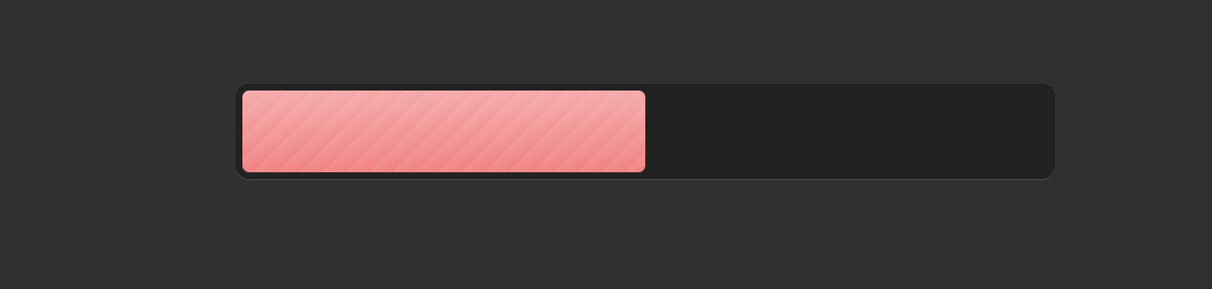
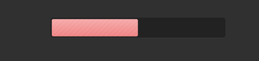
We’ll start with a simple HTML structure and then add some CSS magic to bring it to life. Here’s what we’re aiming for:
- A dark-themed background
- A container for our progress bar
- An animated bar that fills up smoothly
The HTML
Our HTML is super simple:
<div class="wrap">
  <div class="prog-bar"></div>
</div>
Just two nested divs – one for the container and one for the actual progress bar.
The CSS Breakdown
Now, let’s break down the CSS into bite-sized pieces:
- Body Styling:
- Dark background
- Sans-serif font for a modern look
- Progress Bar Container (.wrap):
- Centered on the page
- Dark background with a subtle shadow for depth
- Progress Bar (.prog-bar):
- Gradient background for a glossy effect
- Animated width change for the progress effect
- Animation:
- Uses @keyframes to smoothly increase the width from 0% to 100%
See the Pen Progress-Bar with HTML , CSS by CSLAB Software Development and Computer Training (@CSLAB) on CodePen.
HTML CODE
<html>
<body>

<!-- Progress Bar Container -->
<div class="wrap">
  <!-- Progress Bar -->
  <div class="prog-bar"></div>
</div>

</body>
</html>
CSS CODE
/* Global Styles */
body {
  background: #303030;
  font: 1.1em sans-serif;
}

/* Progress Bar Container */
.wrap {
  box-sizing: border-box;
  margin: 70px auto;
  padding: 5px;
  width: 600px;
  border-radius: 10px;
  background: #222;
  box-shadow: inset 0 0 1px rgba(0,0,0,.6), 0 1px rgba(255,255,255,.1);
}

/* Progress Bar */
.prog-bar {
  height: 60px;
  border-radius: 5px;
  background:
    -webkit-repeating-linear-gradient(-45deg, rgba(255,255,255,.1), rgba(255,255,255,0) 12px),
    -webkit-linear-gradient(#F5A8A8, #F08080);

  /* Animation */
  -webkit-animation-name: slide;
  -webkit-animation-duration: 2s;
}

/* Keyframes for Progress Bar Animation */
@-webkit-keyframes slide {
  0%   { width:  0%; }   /* Start width */
  30%  { width: 50%; }   /* Width at 30% of animation */
  70%  { width: 80%; }   /* Width at 70% of animation */
  100% { width: 100%; }  /* End width */
}

/* Media Query */
@media screen and (max-width: 768px) {
       .wrap {
  width: 500px;
}
        }

@media screen and (max-width: 640px) {
       .wrap {
  width: 400px;
}
        }

   @media screen and (max-width: 425px) {
       .wrap {
  width: 400px;
}
        }
Key Takeaways
- CSS animations can create engaging visual effects without JavaScript
- Gradients and shadows add depth to simple designs
- A few lines of code can create a professional-looking component
Remember, web design is all about experimenting and having fun. Try tweaking the colors, animation timing, or add some text to make this progress bar your own!
Happy coding, everyone! 🚀