
Hey there! Vishnu Rajoria here from CSLAB Computer Institute in Sikar. As a coding instructor and full-stack developer, I love sharing cool web tricks. Today, let’s dive into creating a fancy text wipe effect using just HTML and CSS.
This effect makes your text appear with a colorful wipe-in animation. It’s eye-catching and can add some flair to your website headers or important text. Let’s break it down:
The HTML
We start with a simple structure:
<h1 class="fancy-wipe">
    <span class="text">Transference</span>
    <span class="wipe-in">Transference</span>
</h1>
Key points:
- We use two spans with the same text
- One span is for the original text, the other for the wipe-in effect
The CSS Magic
Now, here’s where the real magic happens. We use several CSS techniques to create this effect:
- Positioning: We position the wipe-in text over the original text.
- Gradients: A colorful gradient gives life to the wipe-in text.
- Masks: CSS masks create the revealing effect.
- Animations: We use keyframe animations for both the text reveal and the wipe-in.
See the Pen Untitled by CSLAB Software Development and Computer Training (@CSLAB) on CodePen.
HTML CODE
<!-- HTML -->
<h1 class="fancy-wipe">
    <!-- Original text -->
    <span class="text">
        Transference
    </span>
    <!-- Text with wipe-in effect -->
    <span class="wipe-in">
        Transference
    </span>
</h1>
CSS CODE
/* CSS */

/* Set basic styles for the entire page */
html {
    width: 100%;
    height: 100%;
    background: #222;
    color: white;
}

/* Center the content vertically and horizontally */
body {
    font-family: Raleway, sans-serif;
    display: flex;
    justify-content: center;
    align-items: center;
    width: 100%;
    height: 100%;
    padding: 0;
    margin: 0;
}

/* Style for the main heading with fancy wipe effect */
.fancy-wipe {
    font-weight: 900;
    font-size: 6rem;
    position: relative;
    --duration: 2s; /* Animation duration variable */
}

/* Style for the original text */
.text {
    color: white;
    animation: text-in var(--duration) infinite linear;
    /* Create a mask for the text reveal effect */
    mask: linear-gradient(to right, white, black 30%, black);
    mask-composite: exclude;
    mask-mode: luminance;
    mask-size: 100% 100%;
    mask-position: 0 0px;
}

/* Style for the wipe-in text effect */
.wipe-in {
    position: absolute;
    left: 0;
    /* Create a colorful gradient background for the text */
    background-image: linear-gradient(
        90deg,
        #fff89a,
        #cdf2ca,
        #a2cdcd,
        #d1e8e4,
        #cab8ff,
        #ff7878,
        #ffc898
    );
    -webkit-background-clip: text;
    -webkit-text-fill-color: transparent;
    animation: wipe-in var(--duration) infinite linear;
    /* Create a mask for the wipe-in effect */
    mask: linear-gradient(to right, black, white);
    mask-composite: exclude;
    mask-mode: luminance;
    mask-size: 50% 100%;
    mask-position: 0px 0px;
}

/* Keyframe animation for the text reveal effect */
@keyframes text-in {
    0% {
        clip-path: polygon(0 0, 0 0, 0 100%, 0 100%);
    }
    50% {
        clip-path: polygon(50% 0, 0 0, 0 100%, 50% 100%);
    }
    100% {
        clip-path: polygon(100% 0, 0 0, 0 100%, 100% 100%);
        mask-size: 1000% 100%;
    }
}

/* Keyframe animation for the wipe-in effect */
@keyframes wipe-in {
    0% {
        clip-path: polygon(0 0, 0 0, 0 100%, 0 100%);
        filter: blur(5px);
    }
    70% {
        clip-path: polygon(50% 0, 100% 0, 100% 100%, 50% 100%);
        filter: blur(5px);
        mask-position: 100% 100%;
    }
    100% {
        clip-path: polygon(100% 0, 100% 0, 100% 100%, 100% 100%);
        filter: blur(0);
        mask-position: 100% 100%;
    }
}
/* media query */
  @media screen and (max-width: 500px) {
    .fancy-wipe {
    font-size: 3rem;
}
}

 @media screen and (max-width: 375px) {
    .fancy-wipe {
    font-size: 2rem;
}
}
Some cool CSS features we’re using:
clip-pathfor revealing textmaskproperties for creating reveal effectslinear-gradientfor colorful backgrounds- CSS custom properties (variables) for easy animation timing control
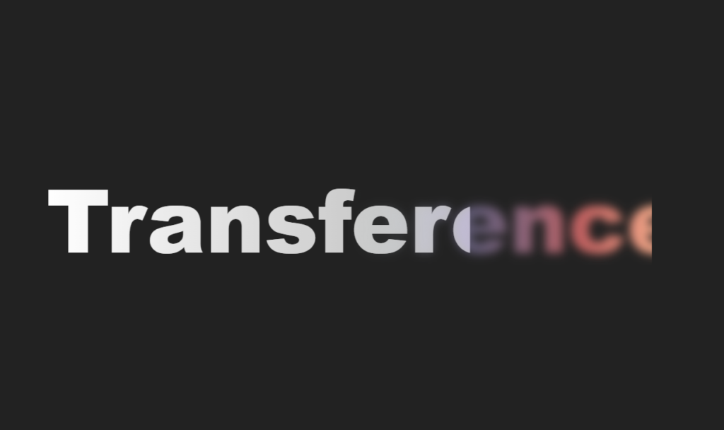
The Result
When combined, these elements create a text that appears to be “wiped in” with a colorful gradient, followed by a white text reveal. It’s smooth, it’s fancy, and it’s sure to grab attention!
Why This Matters
As a developer, it’s crucial to know how to create engaging UI elements. This effect:
- Draws user attention to important text
- Demonstrates advanced CSS techniques
- Can be customized easily for different projects
Remember, the web is not just about functionality—it’s also about creating engaging experiences. Effects like these can make your sites more memorable and fun to use.
That’s all for today, folks! Keep coding, keep creating, and don’t forget to have fun with it!
Vishnu Rajoria
Full Stack Developer & Coding Instructor
CSLAB Computer Institute, Sikar