Hey everyone! Vishnu Rajoria here from CSLAB Computer Institute in Sikar. As a coding instructor and full stack developer, I love sharing fun and practical projects. Today, we’re going to create an awesome battery charging animation using just HTML and CSS. Let’s dive in!
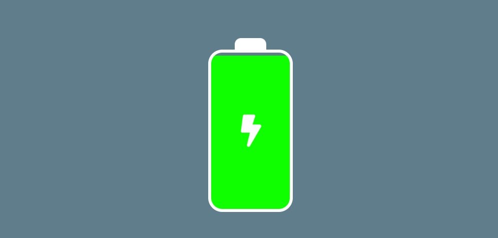
What We’re Building
We’re creating a visual representation of a battery charging. It’s a great way to learn about HTML structure and CSS animations. Here’s what our animation will do:
- Show a battery icon
- Display a lightning bolt inside the battery
- Animate the charging process with changing colors
- Make the lightning bolt pulsate
The Key Components
- HTML Structure: We’re using simple div elements to create our battery shape.
- CSS Variables: We’re defining colors using CSS variables for easy customization.
- Flexbox: This helps us center our battery on the page.
- CSS Animations: We’re using @keyframes to animate the charging process and the lightning bolt.
Cool Features to Note
- The battery “fills up” from bottom to top
- Colors change as the battery charges (red → orange → yellow → green)
- The lightning bolt icon pulsates
Why This Project is Awesome for Beginners
- It’s visually appealing
- Uses only HTML and CSS (no JavaScript required)
- Teaches you about CSS animations
- Shows how to structure a small project
HTML Code
<!DOCTYPE html>
<html lang="en">
<head>
    <meta charset="UTF-8">
    <meta name="viewport" content="width=device-width, initial-scale=1.0">
    <title>Battery Charging Animation</title>
    <!-- Font Awesome CSS for battery icon -->
    <link rel="stylesheet" type="text/css"
    href="https://cdnjs.cloudflare.com/ajax/libs/font-awesome/5.15.4/css/all.min.css">
    <!-- Custom CSS file -->
    <link rel="stylesheet" type="text/css" href="style.css">
</head>
<body>
    <!-- Battery container -->
    <div class="battery">
        <!-- Battery head (top part) -->
        <div class="battery-head"></div>
        <!-- Battery body -->
        <div class="battery-body">
            <!-- Lightning bolt icon -->
            <i class="fas fa-bolt"></i>
            <!-- Charging animation element -->
            <div class="charge"></div>
        </div>
    </div>
</body>
</html>
CSS Code
/* Color variables */
:root {
    --red: #ff0000;
    --orange: #ff9100;
    --yellow: #fff200;
    --yellow-green: #d7fc03;
    --green: #00ff00;
    --body: #607d8b;
    --gray: #9e9e9e;
    --white: #ffffff;
}

/* Body styles */
body {
    width: 100vw;
    height: 100vh;
    background: var(--body);
    overflow: hidden;
    display: flex;
    align-items: center;
    justify-content: center;
}

/* Battery head styles */
.battery-head {
    width: 40px;
    height: 15px;
    background: var(--white);
    margin: 0 auto;
    border-top-right-radius: 8px;
    border-top-left-radius: 8px;
}

/* Battery body styles */
.battery-body {
    width: 100px;
    height: 200px;
    background: transparent;
    position: relative;
    margin: 0 auto;
    border: 4px solid var(--white);
    border-radius: 18px;
}

/* Lightning bolt icon styles */
i.fa-bolt {
    color: var(--white);
    font-size: 40px;
    position: absolute;
    left: 38%;
    top: 40%;
    z-index: 1;
    animation: battery-bolt 2s linear infinite;
}

/* Charging animation element styles */
.charge {
    width: 100%;
    position: absolute;
    bottom: 0;
    animation: battery-charge 8s linear infinite;
    z-index: -1;
    border-radius: 0 0 12px 12px;
}

/* Battery bolt icon animation */
@keyframes battery-bolt {
    50% {
        transform: scale(1.3);
    }
    100% {
        transform: scale(1);
    }
}

/* Battery charge animation */
@keyframes battery-charge {
    0% { height: 0%; background: var(--red); }
    25% { height: 25%; background: var(--orange); }
    50% { height: 50%; background: var(--yellow); }
    75% { height: 75%; background: var(--yellow-green); }
    100% { height: 100%; background: var(--green); }
}
Key Takeaways
- CSS animations can create engaging visual effects
- Simple shapes can be created using HTML and CSS
- CSS variables make it easy to manage colors
- Combining multiple animations can create complex effects
I hope this project inspires you to explore more with HTML and CSS. Remember, coding is all about experimenting and having fun while learning. Keep practicing, and you’ll be amazed at what you can create!
Got questions? Feel free to reach out to me at CSLAB. Happy coding, everyone!